
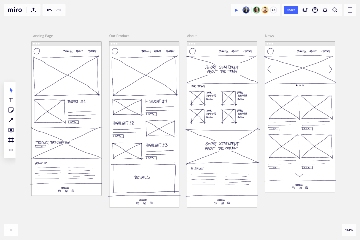
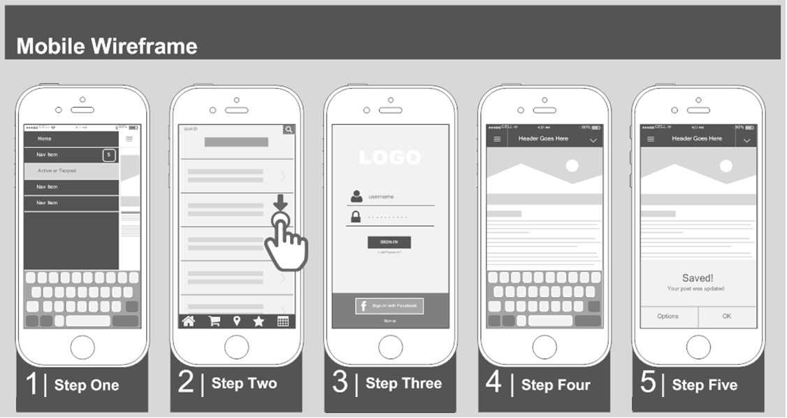
How to use wireframe effectively?
The use of wireframe can bring many benefits to both the development team and clients, but this is the case only when you use it wisely and properly. A typical misuse of wireframe is to treat it as a replacement of screen design. This makes the production and refinement difficult and costly, reducing the usefulness of wireframing. In this section, we will go through some of the effective wireframing tips.
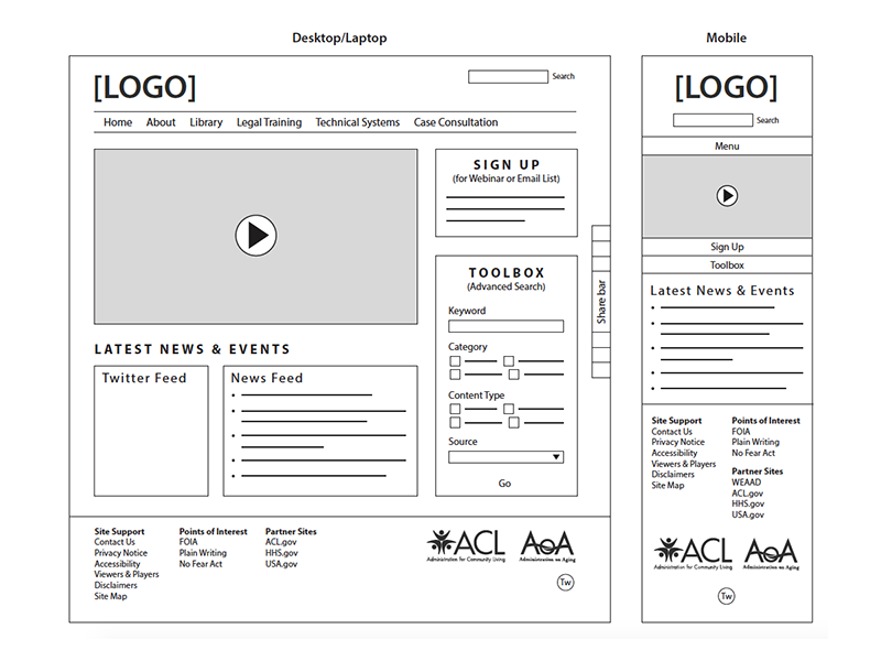
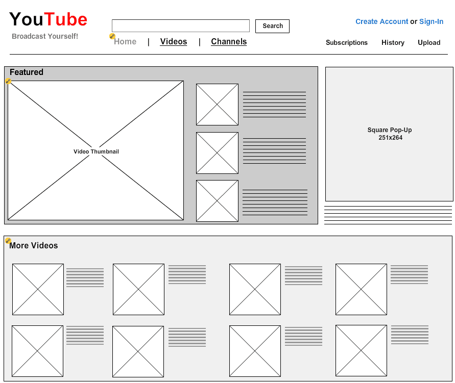
- A wireframe is intended to be simple and just enough. It is simple so that it can be produced quickly and easily, and makes no hesitation for a discard and re-work. The low-fi presentation also makes it more comprehensive and communicative. Therefore, do not need to spend too much time on beautifying the drawing, aligning things, or using pretty typology and etc.
- In a wireframe, instead of showing any actual content, we can replace a large chunk of text (the actual context) with a placeholder of text. This is to avoid time being spent on preparing the content unnecessarily, and to prevent the readers from being distracted by the text content. But if the displaying of text is needed, you may consider placing some dummy text there instead. You can easily find a dummy text generator on the internet.
- The use of annotation helps you describes an element (e.g. «Company logo») or to explain something related to its behavior (e.g. «Hide in 5 seconds»). Use it if necessary. But again, don’t attempt to document each of the wireframe elements. You should only use annotation whenever it necessary.
- Wireframes can be hand-drawn, but we usually create wireframes with software for more efficient and easier to manage of our works. Besides, some wireframe software provides you with features that paper-and-pencil cannot accomplish. Here are three of them:
- State — The wireframing tool of Visual Paradigm supports the concept of state, which allows you to create a child wireframe based on an existing one. It is not only save you time in creating a screen flow with a sequence of similar child wireframes, it also makes refinements of the related child wireframes much easier (as we make changes in the initial state of a wireframe, the changes will also be reflected in all its’ child states wireframes)
- Storyboard — A storyboard presents the screen flow of a particular scenario. It makes the wireframes more manageable and the presentation much easier.
- Managing wireframes by User story — User story is an agile tool for recording user’s concerns and requirements. To include wireframes as part of a user story’s scenario shows how user will use the feature in do part of their job described in that user story. Besides, when developer start implementing the user story, he can check the wireframe to gain ideas about user’s expectation.
Visual Paradigm provides all the wireframe tools and elements you need in drawing web wireframes, desktop application wireframes, android apps wireframe and iOS apps wireframe (iPhone and iPad). It also supports agile software development and UX design tools, which includes user story tool, sprint development, storyboard, etc.
Что дает wireframe?
Wireframe использует заполнители, такие как поля с метками, для представления контента, который будет добавлен позже.
Дизайнеры используют wireframe из-за следующих преимуществ:
- Структурированный дизайн. Вы знаете, где все будет размещаться, еще до перехода к конкретным техническим деталям.
- Создание основы на раннем этапе. Меню навигация и макет определяют, как будет разрабатываться остальная часть проекта. Если есть проблема, лучше выявить ее в начале, а не на этапе детализированного прототипа.
- Дизайн сфокусирован на контенте.
- Больше возможностей для креатива и экспериментов. Wireframe легко создавать. Поэтому вы можете экспериментировать, не затрачивая много времени и усилий.
Wireframe — это скелет дизайна.
Pidoco- Online Wireframe and UX Prototyping Tool
Platform: Web-based
Price: Starter — $12 /MO
Standard -$25/MO
Premium- $55/MO
Platinum -$175/MO
Pidoco offers a better way to wireframe. You can create clickable wireframes for websites and mobile apps with this online wireframing tool. It is software that lets you quickly create click-through wireframes and fully interactive UX prototypes.
- Interactivity. Create fully interactive prototypes to simulate what your application will really feel like.
- Collaboration. Share prototypes, collect comments and edit screens with others in real-time.
- Mobile Simulation. Test drive your prototypes on iOS and Android devices in real-time.
- Exports & Specifications. Generate handy specification documents at the click of a button to hand to your development team as a blueprint or to clients for sign-off. Or export your prototypes as PNG wireframes or vector files or as HTML for times when you are offline.
- Reusable Components. Create custom building blocks, layers and masters that will make your prototyping super fast and improve design consistency in your projects.
- Usability. Pidoco is easy to learn and easy to use so you will be productive from minute one.
- Integrations & Customizing. Pidoco integrates with apps like Planio or JIRA via our API.
- Software-as-a-Service & Security. Pidoco lives in the cloud insecure German data centers, so you do not need to install software, run updates or buy licenses for each new user.
Cons:
- There are no rotating options if I wanted to flip a symbol.
- Templates are kind of limited.
- Lack of inherent stencils.
- Too lo-fidelity for many stakeholders to absorb designs.
- No drag-and-drop solution.
- Lack animation.
- Not software prototyping.
User feedback: «Our customer was able to see the screen mockups, even before the implementation started, which avoided misunderstandings.» -Max Ahrens, Productmanager at zimory, Berlin, Germany
Marvel (Web)
Best wireframe tool for pre-designed wireframe templates
![]()
While many apps allow you to add individual UI components like buttons and input boxes, Marvel includes a new option: UI blocks. These blocks are pre-designed sections built of multiple elements, like a Footer Block that includes a background color, footer menu text, site icon placeholder, and copyright text. The UI blocks make the webpage wireframing process move more quickly, so you can achieve an aesthetically appealing wireframe in a fraction of the time.
If you’re part of a multi-member design team, you can invite your coworkers to collaborate and comment on the wireframe, and you even compile a team library so that design elements can be snagged easily throughout the process.
The biggest drawback is that Marvel doesn’t give you a lot of tools for high-fidelity mockups, so you might find yourself hopping over to Sketch (which integrates) to create a more polished UI design.
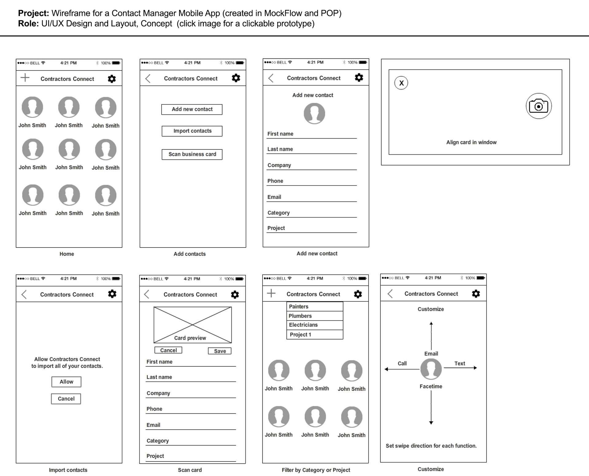
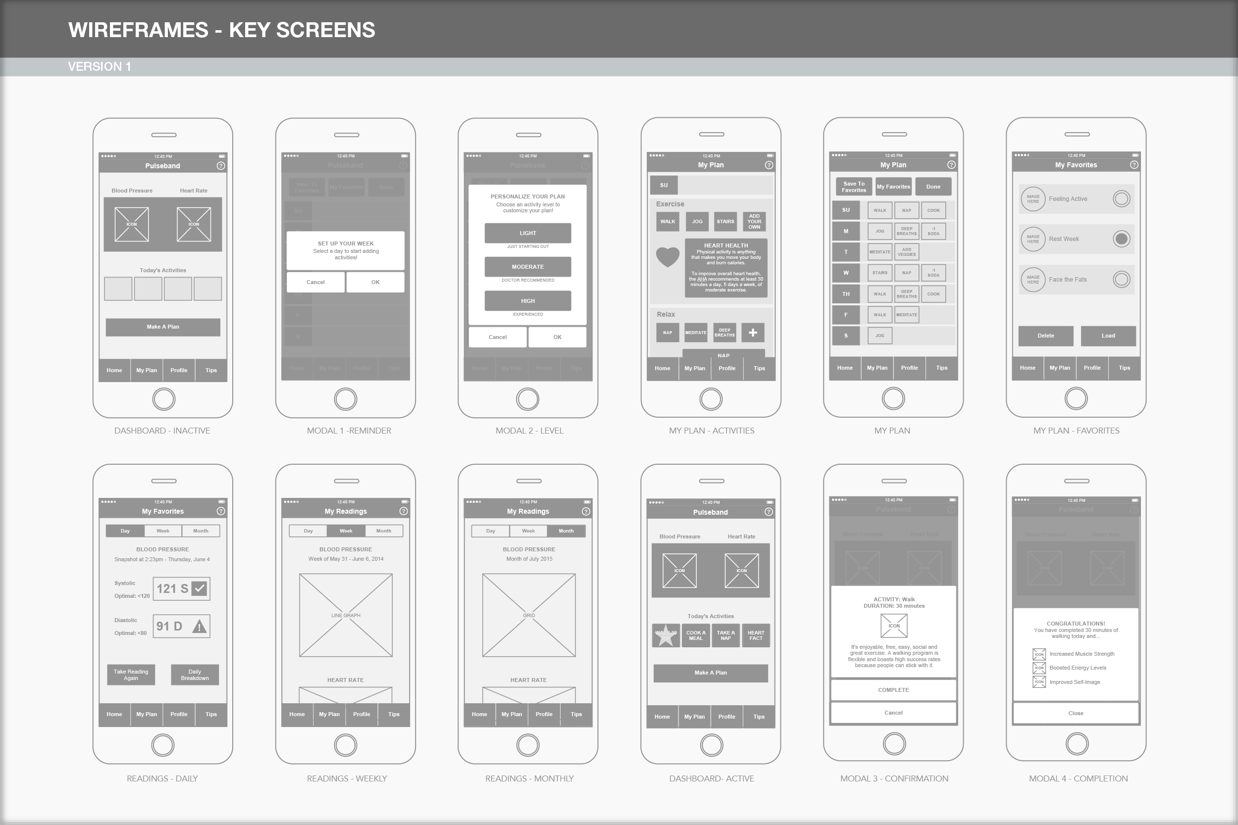
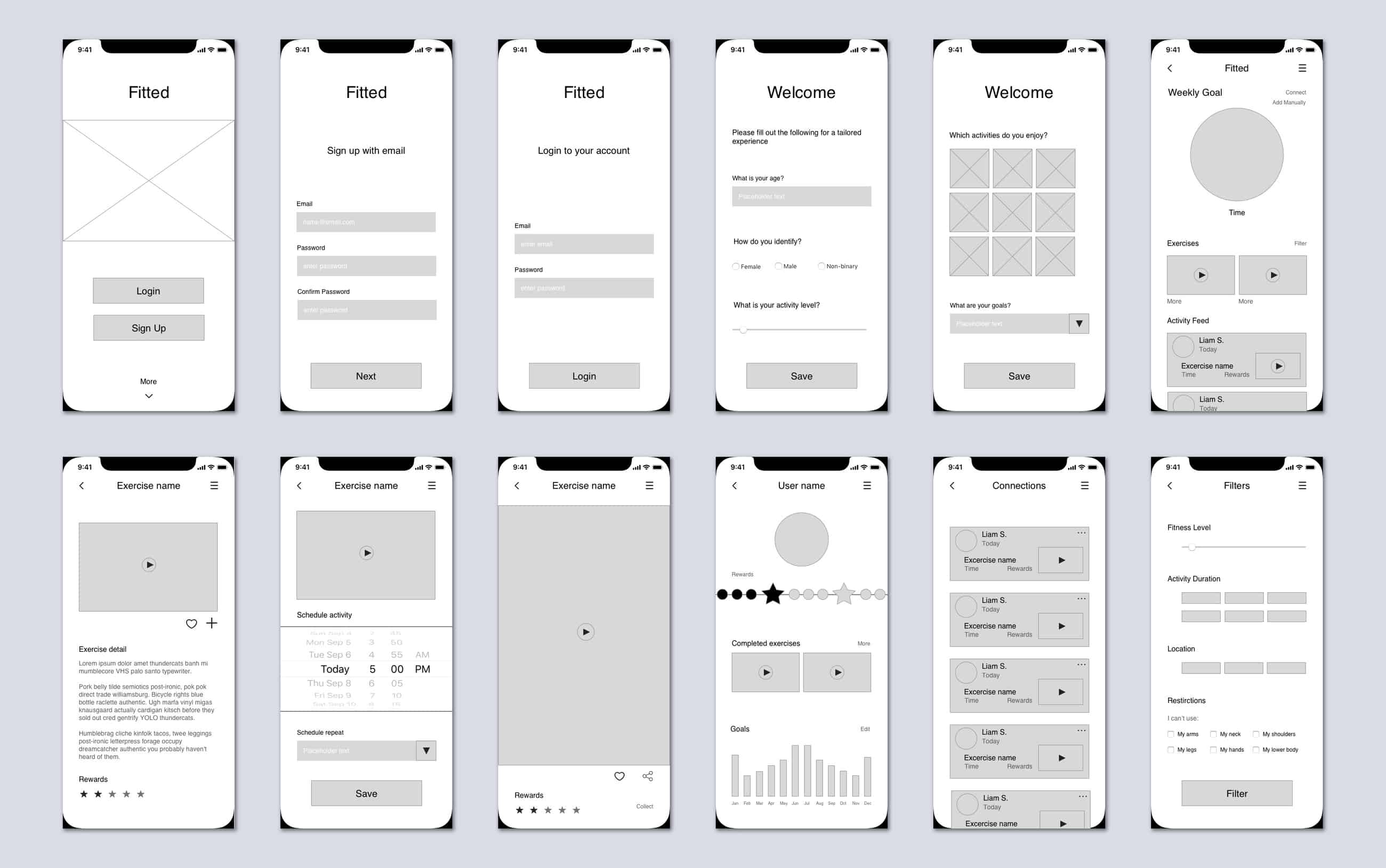
What are the different types of wireframes?
There are three main types of wireframes: low-fidelity wireframes, mid-fidelity wireframes, and high-fidelity wireframes. The most significant distinguishing factor between these wireframes is the amount of detail they contain.
Let’s look at these more closely:
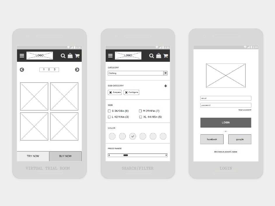
Low-fidelity wireframes
Low-fidelity wireframes are basic visual representations of the webpage and usually serve as the design’s starting point. As such, they tend to be fairly rough, created without any sense of scale, grid, or pixel-accuracy.
Low-fidelity wireframes omit any detail that could potentially be a distraction and include only simplistic images, block shapes, and mock content—such as filler text for labels and headings.
Low fidelity wireframes are useful for starting conversations, deciding on navigation layout, and mapping the user flow. In short, low-fidelity wireframes are ideal if you’ve got stakeholders or clients in the room and you want to sketch something up with a pen mid-meeting. They’re also incredibly useful for designers who have multiple product concepts and want to quickly decide which direction to go down.
Mid-fidelity wireframes
The most commonly used wireframe of the three, mid-fidelity wireframes feature more accurate representations of the layout. While they still avoid distractions such as images or typography, more detail is assigned to specific components, and features are clearly differentiated from each other.
Varying text weights might also be used to separate headings and body content. Though still black and white, designers can use different shades of grey to communicate the visual prominence of individual elements. Although they are still relevant in a product’s early stages, mid-fidelity wireframes are usually created using a digital wireframing tool, such as Sketch or Balsamiq.
Source: Katherine Lu’s portfolio
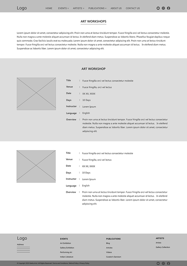
High-fidelity wireframes
Finally, high-fidelity wireframes boast pixel-specific layouts. Where a low-fidelity wireframe may include pseudo-Latin text fillers and grey boxes filled in with an ‘X’ to indicate an image, high-fidelity wireframes may include actual featured images and relevant written content.
This added detail makes high-fidelity wireframes ideal for exploring and documenting complex concepts such as menu systems or interactive maps.
High-fidelity wireframes should be saved for the latter stages of the product’s design cycle.
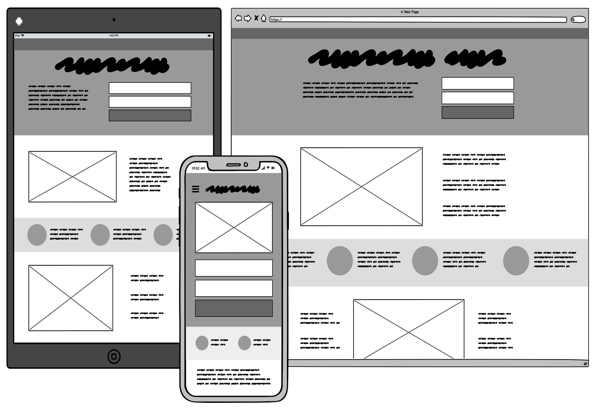
Wireframe
![]()
Что такое вайрфрейм?
Вайрфрейм — это низко детализированное представление дизайна. Он чётко должен показывать:
- Основные группы содержимого. Что?
- Информационную структуру. Где?
- Описание взаимодействия пользователя с интерфейсом и его примерную визуализацию. Как?
Вайрфрейм — не просто бессмысленный набор серых блоков, хотя это выглядит именно так. Считайте это скелетом вашего дизайна и запомните, что в вайрфрейме должны быть представлены все важные элементы конечного продукта.
«Представлены» — это ключевое слово, которое поможет вам найти правильный баланс между уровнем детализации и скоростью создания
Нельзя уходить в детали, но с другой стороны, нужно создать цельное представление конечного дизайна и не пропустить ни одного важного элемента. Вы описываете фронт работ по проекту для всех задействованных лиц: разработчиков, дизайнеров, копирайтеров, менеджеров — всем им нужен хорошо сработанный вайрфрейм
По сути, вы создаёте карту города. Каждая улица должна на ней быть, но в очень упрощённом виде. Смотря на карту, вы можете оценить планирование города, но не можете увидеть его красоту.
Вайрфреймы должны создаваться быстро и большую часть этого времени следует провести за обсуждениями с командой и размышлениями. Само таскание серых блоков по экрану должно занимать минимум времени.
Внешний вид должен быть эстетичным, но очень простым. Чёрно-серо-белый — типичная палитра вайрфрейма (вы можете добавить синий, чтобы обозначить ссылки).
Если, например, выбор пиктограмм или загрузка картинок занимает слишком много времени, их можно заменить заглушками — накрест перечёркнутыми прямоугольниками с соответствующим описанием. Мы склонны полагать, что вайрфрейм даёт неполное представление о конечном результате.
Запомните, хороший вайрфрейм ложится в основу чистового дизайна и определяет направление работы для всей команды.
Когда использовать вайрфреймы?
Обычно вайрфреймы используются как документация по проекту. Так как они показывают взаимодействие пользователя с интерфейсом в отдельных статичных моментах, их нужно сопровождать текстовыми комментариями: как короткими пояснениями, так и комплексной технической документацией, при необходимости.
Однако они могут использоваться менее формальным способом. Так как они просты и быстро создаются, они, как зарисовки, хорошо подходят для обсуждения внутри команды. Если разработчики спрашивают, как что-то должно быть сделано, ответ может быть дан в виде быстро сделанного вайрфрейма.
Вайрфреймы сложно приспособить для юзабилити-тестирования, хотя они могут пригодиться для получения отзывов во время начального «партизанского» исследования, когда вам срочно требуется озарение и вас не беспокоит методологическая чистота.
В общем процессе дизайна вайрфреймы могут быть неожиданно эффективны и, хоть в последние годы о них отзывались не очень, они остаются важным начальным этапом сложных проектов.
Conduct research to get clarity and direction
It may be tempting to start pouring out your wireframe ideas immediately, but before you do that, think of the larger goal: designing a compelling user interface (UI). And to do that, you will need to gauge the requirements of your design project and the expectations of your stakeholders and end users.
Your design should not only help the business deliver its message or products to customers but more importantly make it easy for customers to navigate the page and find what they need without much hard work.
Here is how you can ace this step:
- Check in with stakeholders to understand key project needs. Getting this clarity is foundational to the wireframe design.
- Research about the end users, their preferences, and buying behaviors so that you can address their needs with the wireframe.
- Based on your end user research, define common use cases to better understand the scenarios you are designing for.
- Conduct market research and competitor analysis to identify design trends and best practices.
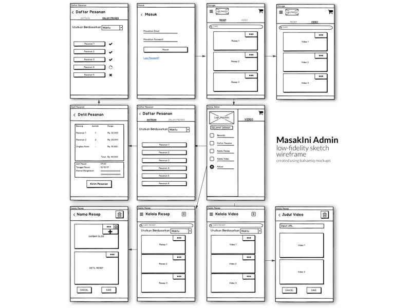
Создание wireframe
Wireframe могут быть созданы с помощью редактора изображений, специализированных инструментов или даже нарисованы на бумаге. Рассмотрим преимущества и недостатки каждого метода.
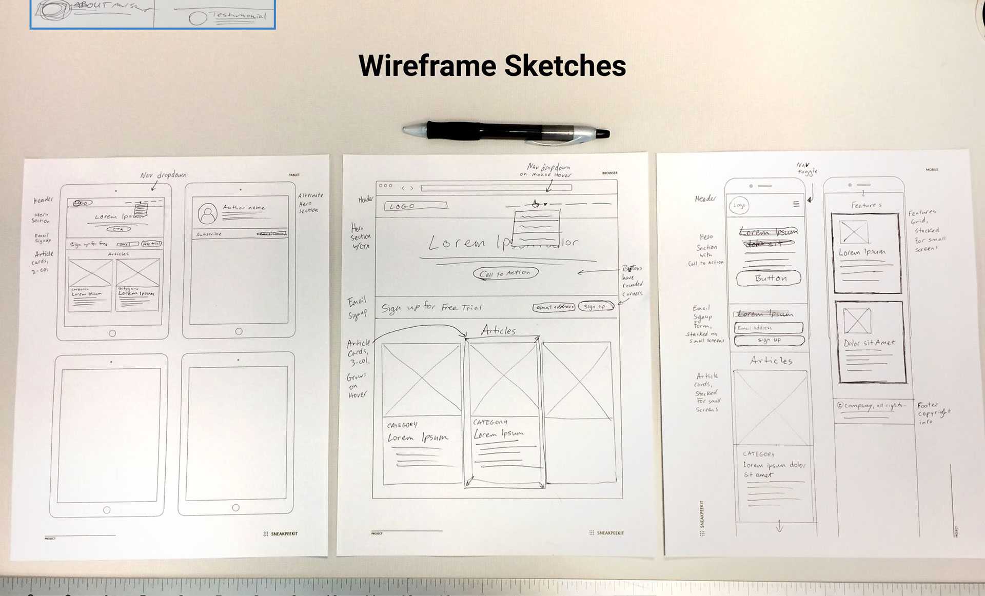
Бумага — самая простая форма wireframe. По сути это просто более продвинутый эскиз. Когда вы хотите проанализировать несколько идей, прежде чем выбрать лучшую, можно довольно быстро создать wireframe на бумаге.
![]()
Такие платформы, как приложение UXPin, облегчают создание интерактивных wireframe, поддерживают разработку макетов и прототипов.
![]()
Если не хотите платить за специализированные платформы, то можно использовать программное обеспечение для презентаций, такое как Keynote или Powerpoint. Но при этом усложняется работа над проектом в команде, так как придется отправлять wireframe по электронной почте.
![]()
Некоторые дизайнеры предпочитают делать все в графических редакторах, таких как Sketch или Photoshop.
Выбор платформы — это только начало. Рассмотрим весь процесс создания поэтапно.
Wireframe контента
Определите первую версию wireframeс блоками контента.
![]()
Wireframeконтента определяет только то, где размещаются публикации, а не то, как они будут представлены. Для этого подходят сетки, если используемый вами инструмент поддерживает их.
![]()
Когда сначала создаете wireframeдля самого маленького экрана, вы можете расставить приоритеты. Альтернативой является одновременное проектирование всех элементов с последующим вычитанием менее важных. Но подобный подход часто приводит к необходимости отката.
После того, как вы разработаете базовый макет, можно начинать добавлять дополнительную информацию.
Why do wireframes look the way they do?
Wireframes typically have an intentional low-fidelity look and feel to them, for the following reasons.
1. Wireframes make it clear that this is not the final design
No one could mistake a wireframe for the final look and feel of your application. Low-fidelity and few colors force you to focus on structure over details. There will be lots of time for visual design once the structure is finalized.
2. Wireframes convey that «this is all up for discussion»
The rough feel encourages discussion. We call it a look no one is afraid to criticize. Wireframes are really quick to make, so don’t be shy with giving feedback! Each screen probably only took a few minutes to make; don’t worry, their author won’t mind doing them over from scratch. What matters the most at this point is the final ease of use, so going through a few iterations is normal and expected.
3. Wireframes make it clear that no code has been written yet
If your customer or stakeholder received some screens that looked like screenshots of the final app, instead of a wireframe, they might assume that all the code behind those screenshots had already been written. This is most often not the case. Wireframes don’t have this danger.
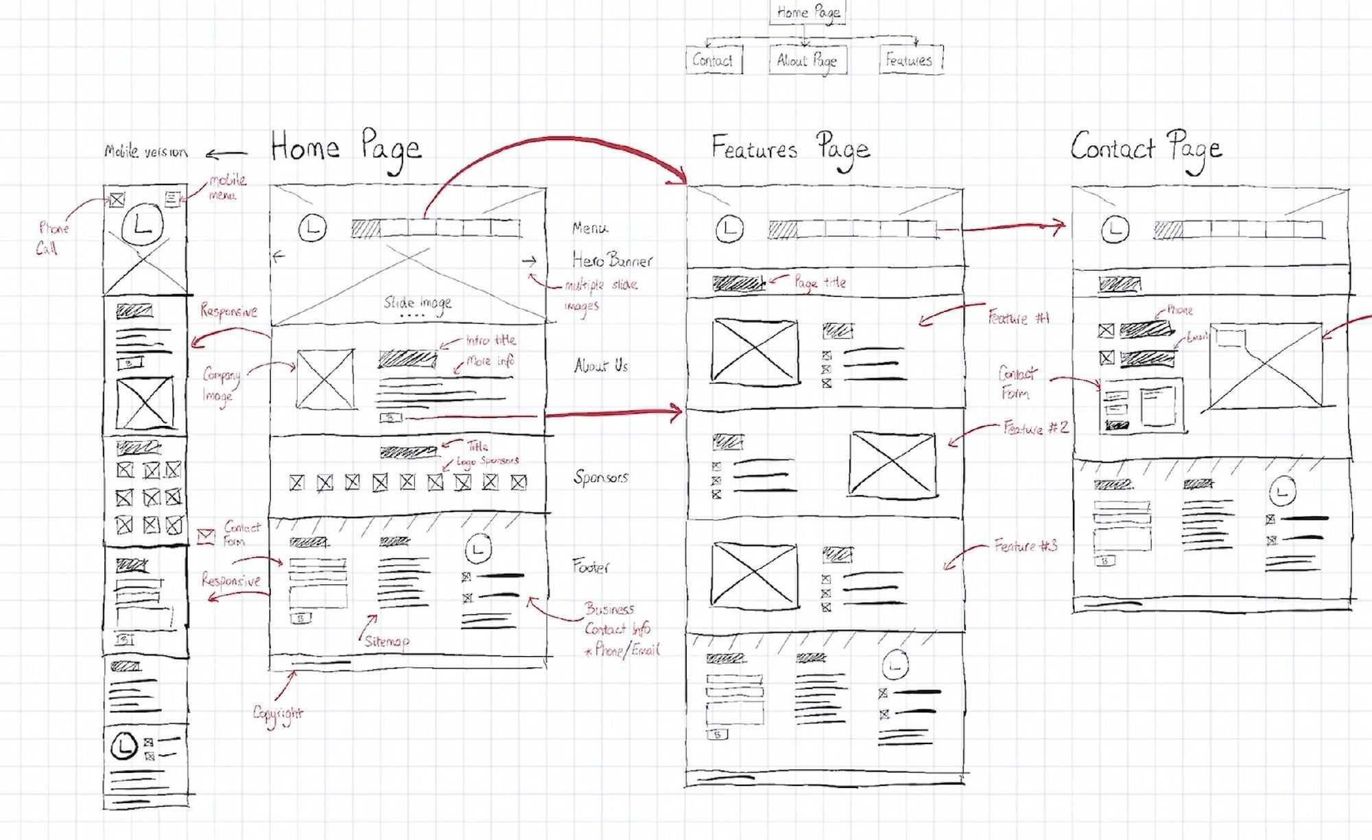
Design Processes That Incorporate Wireframes
Sketch To Code Process
- Sketch
- Wireframe
- Lo-Fi Prototype
- Hi-Fi Mockup
- Hi-Fi Prototype (Rapid)
- Code
The standard (and safest) design process doesn’t cut any corners.
Initial sketching eliminates some of the less promising ideas prior to wireframing. The wireframe then sets the stage, suggesting the best proposals for content structure. Next, a lo-fi prototype is created from the wireframe itself by adding interactivity; this is tested for valuable early-stage feedback that can be incorporated before fine-detailing takes place.
A high-fidelity mockup would then finalize the visuals that are incorporated into a new prototype. A series of rapid prototyping (multiple quick prototypes that integrate feedback with each iteration) prepares the product for its final stages in coded development.
Wireframe to Code Process
- Wireframe
- Lo-Fi Prototype
- Hi-Fi Mockup
- Code
While the scenario above is a more complete process, some teams don’t have the necessary resources. Here is the leanest possible design process we’d recommend.
First, all concepts are illustrated in the wireframe instead of sketching. From there, we transform the wireframe concepts into a lo-fi prototype so we can test the interaction design as early as possible. You want to test these user flows first to ensure that your design actually functions properly.
The project moves directly into finalizing the visuals with a mockup, then moving straight to production code. At this point, the designer and developer can continue testing and iterating in code.
![]()
Source: UXPin
Sketch To Code Cleanup Process
- Sketch
- Wireframe
- Coded Lo-Fi Prototype
- Coded Hi-Fi Prototype
- Code Cleanup
If you’re a designer with coding chops, you can start building your product’s technical foundation right from the beginning stages.
As before, initial concepts are honed through sketching and wireframing, but this time, the wireframe is then built as a coded, lo-fi prototype. The prototype is successively tested and reiterated into coded, hi-fi prototypes.
Toward the end, all residual dead weight code from the iterations is cleaned up.
Wireframe To Code Cleanup
- Wireframe
- Lo-Fi Prototype
- Coded Hi-Fi Prototype
- Code Cleanup
For designers who are comfortable coding high-fidelity elements, this process allows them to bypass Photoshop and Sketch. The wireframe is turned into a lo-fi prototype and tested repeatedly until core usability issues are resolved.
Once that happens, a hi-fi prototype is created in code and again tested until a satisfactory version is reached. The code is again cleaned up.
No Hi-fi Wireframes
No matter which process you choose, one thing remains the same: Wireframes should always be low fidelity. That’s because hi-fi wireframes would be a waste of time—it’s not their role to pin down fine details.
All processes follow the same basic progression:
information structure => user flows/interaction design => visual fidelity.
In other words, the benefit of wireframes runs out by the time you tackle visuals.
![]()
Source: UXPin based on JFarny
Sketch (macOS)
Best wireframe tool for passing wireframes off to third-party apps
![]()
When it’s time for hand-off, you can use the Export option to save your full designs and/or individual elements. Or, you can seamlessly integrate Sketch with tools further down your design process (including prototyping apps Principle, Framer, and Marvel, to name a few). Sketch has developed a reputation for encouraging and supporting an entire developer community devoted to building integration plugins. This has opened up a world of opportunity for Sketch users to quickly transport their designs to the «next step,» allowing dev and design teams to communicate much more easily. While other wireframe tools, like InVision and Adobe XD, have also opened themselves to plugin integrations, Sketch currently owns that space simply due to its longevity.
We did experience a few bugs in the interface, like font colors that wouldn’t change and a lag in duplicating simple shapes. While frustrating, these glitches were just a blip on the radar in an otherwise excellent app.
Sketch Price: $99/year; when the year is over, you can continue to use the tool, but you’ll no longer receive software updates.
These free wireframe software solutions can help you create basic design structures for websites and apps to be shared with stakeholders and clients.
From getting approval from stakeholders to onboarding clients and continually incorporating their feedback—building websites and mobile apps is a complex, ongoing process with a lot of moving parts. If the project doesn’t get off to a good start, you’ll spend a lot of time and resources on bug fixes and updates.
A wireframe tool can help save the effort and cost of redoing work. You can draw up a basic design wireframe, create prototypes, share them with stakeholders and clients, and gather feedback in one place.
What’s more: There are free wireframe tools available that offer competent features.
We’ve compiled a list of the three top-rated free and open-source wireframe software solutions from Capterra’s directory. Each of these has an above-average overall user rating (4 stars or higher), 10+ user reviews in the past one year, and offers three or more wireframe tool features (such as wireframe creation, drag-and-drop editor, and design templates).
This article looks at three highly rated free wireframe software options. See the full list of free wireframe software solutions here.
Read more about our .
Prototype
![]()
Что такое прототип?
Прототип, часто путаемый с вайрфреймом, — это средне или высоко детализированное представление конечного продукта, которое имитирует взаимодействие пользователя с интерфейсом. Он должен позволять пользователю:
- Оценить содержание и интерфейс;
- Протестировать основные способы взаимодействия, как если бы это был готовый продукт.
Прототип — это имитация взаимодействия пользователя с интерфейсом конечного продукта. Он может не выглядеть в точности как конечный продукт, но определённо не должен быть наброском в оттенках серого. Взаимодействия должны быть аккуратно смоделированы и быть максимально похожими на то, что будет в конечном продукте. Связь между интерфейсом (фронтендом) и бэкендом обычно опускают для сокращения издержек и ускорения процесса.
Когда использовать прототип?
Потенциал прототипов полностью раскрывается при пользовательском тестировании. С помощью этой имитации можно получить много материала для улучшения юзабилити ещё до фактического начала разработки.
Прототипы обычно не очень подходят для документации, так как понять работу интерфейса можно только в процессе взаимодействия с прототипом. С другой стороны, прототип — это наиболее привлекательная форма документирования дизайна, так как интерфейс представляется как есть.
Учтите, что прототипирование — это довольно дорогостоящая и длительная форма разработки и обсуждения дизайна. Я рекомендую создавать прототипы, которые потом можно повторно использовать при разработке (да, это значит, что вам придётся кодить HTML, CSS и, возможно, JS). Это особенно эффективно в относительно простых проектах.
Если всё сделано правильно, то в сочетании с юзабилити-тестированием прототипирование себя окупит.
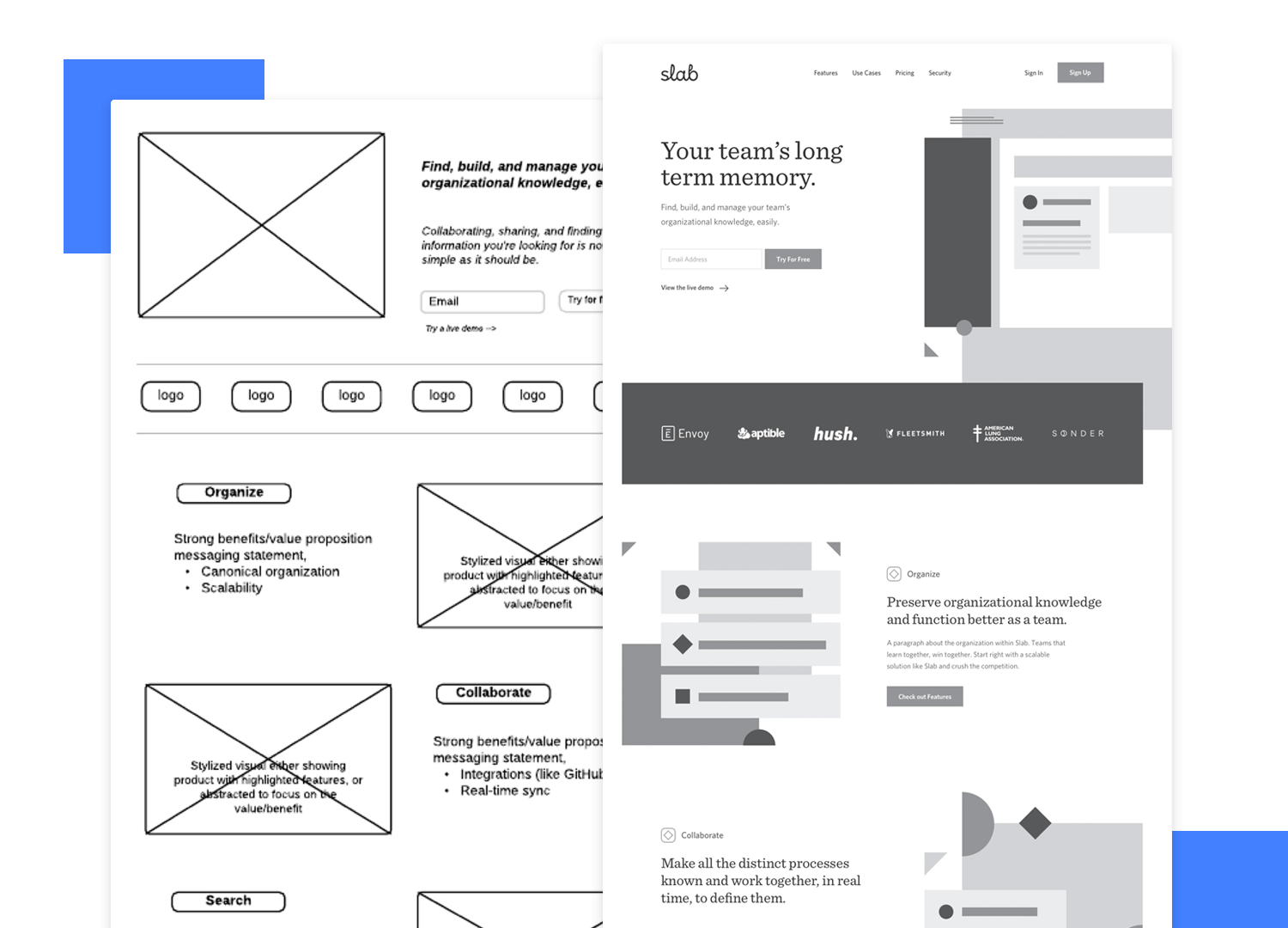
Что использовать вместо вайрфреймов
При работе над дизайном в первую очередь вы должны визуализировать свой продукт, так как необходимо увидеть собственными глазами, как это будет выглядеть в целом. Затем необходимо добавить больше деталей и конкретики, утвердить разработанную схему и наметить направление, по которому будет следовать работа.
Вайрфреймы — это средняя ступень процесса дизайна. Они не дадут вам понять, какое влияние окажет конечный продукт на пользователей. Поэтому они не представляют собой особой ценности. Если же вы внимательнее сфокусируетесь на предыдущих стадиях — мозговом штурме, пути клиента и UI-скетчинге — вы легко сможете перепрыгнуть на стадию разработки качественного дизайна.
В первую очередь, сфокусируйтесь на общей картине вашего проекта. Лучший способ — это делать наброски на бумаге и маркерных досках во время стадии мозгового штурма. Намеченные диаграммы и схемы дадут вам понять, куда вам нужно двигаться дальше, и это могут подтвердить некоторые эвристические данные.
![]()
Многие дизайнеры считают, что скетчи — это вайрфреймы на бумаге, но это два совсем разных понятия. При создании скетчей вы представляете общую концепцию UI-дизайна. При создании же вайрфреймов вам необходимо продумывать какие-то детали и схемы, что может отключить на время вашу креативность. Если вы планируете создавать вайрфреймы, им всегда должны предшествовать скетчи.
И вроде вы уже начали привыкать, что нужно все время делать эти дурацкие бело-серые схемы. Но теперь пора начать о них забывать.
Лучше всего сразу переходить к созданию высококачественных мокапов, которые будут с максимальной точностью отражать все ваши идеи. А такие быстрые и мощные приложения как Sketch или Adobe XD помогут вам в этом.
Для наилучшего эффекта, прежде чем перейти к работе над тем или иным проектом, вы можете подготовить сет из стандартных UI-элементов. Соберите их в гид по стилю и используйте в качестве символов (в программе Sketch или XD). Разработка системы дизайна — это отличная способность, которая усовершенствует процесс работы над материалами и поможет вам поддерживать согласованность между всеми элементами проекта.
Что такое вайрфреймы?
Если создание вайрфреймов для вас — привычное дело, можете пропустить этот раздел и перейти к «Недостаткам вайрфеймов».
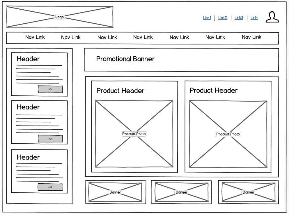
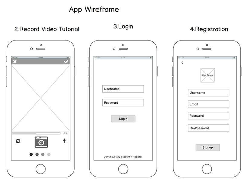
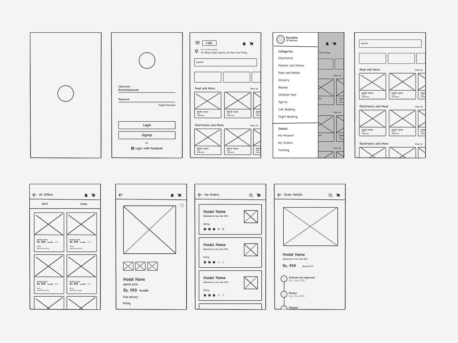
Вайрфреймы — это схематичные разметки экрана. Их цель — показать, что из себя будет представлять проект.
Классические вайрфреймы строятся из серых и белых блоков. Допускается использование символов. Но никаких изображений в вайрфрейме быть не должно. Если все-таки без них не обойтись, рекомендуется использовать плейсхолдеры.
Вайрфреймы предназначены для отображения замысла проекта в простой и понятной форме. Они просматриваются и одобряются стейкхолдерами и разработчиками. Над ними работают до того, как дизайнер начинает создавать высококачественные мокапы, на которые требуется гораздо больше времени.
Кроме того, эти наброски помогают убедиться, что архитектура контента спланирована корректно
Очень важно следить за тем, чтобы в вайрфрейме были указаны уместные текстовые ресурсы, а не какие-то пустые плейсхолдеры
Наконец, вайрфреймы позволяют легко визуализировать навигационные схемы и процессы. Зачастую наброски прототипов строятся именно благодаря им. Таким образом, дизайнеры без проблем могут проверить и утвердить какие-то аспекты плана проекта.
Moving from wireframes towards a finished product
Starting with sketches and moving forward, there are often many steps between the beginning and end of the product design process. Let’s take a look at a few more terms you might come across:
- We’ve already talked about wireframes. They serve as the skeleton of a digital product. They give you a general idea of the layout and construction. Beyond the skeleton of the design, the content and copy is the muscle of the product. Aim to have the content early in the process. Lorem ipsum never does your design justice. It’s helpful to have the actual content in place to make sure everything flows the way you want.
- The next step in the process is a high-fidelity mockup. Mockups are a more visual representation of your product. Think of a mockup like skin or facial features. This is the part where you firm up your visual decisions by testing variations and begin to give your product some character.
- The final step before handing your design off to the developers is the prototype. Making a prototype is like dressing your mockup and making it suitable for the public. It’s not the final version, but it’s acceptable to show to other people. This is the point where all you should need to do is make tiny tweaks before you send your model over to production.
Remember that wireframes are only the first or second step towards a prototype. Because prototypes are meant to be the most functional draft of your product, wireframes serve to help you focus the placement of content and set a course towards a functioning prototype.
Why Make Wireframes?
It may be tempting to skip wireframing and provide clients with high-fidelity mock ups instead. However, wireframing provides a few key benefits:
- Brainstorming design ideas and iterating rapidly
- Soliciting feedback from stakeholders, team members, and clients before devoting resources to a more refined design effort
- Making sure that everyone is on the same page and shares the same vision
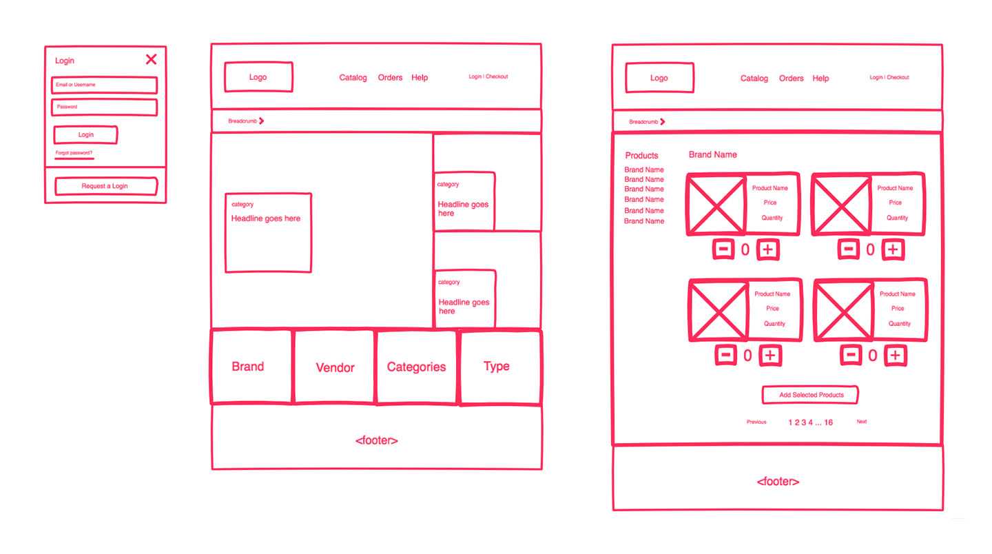
- Translating the site’s information architecture into visual design paths by defining navigation elements such as headers, sidebars, footers, and buttons
- Highlighting any potential problems and flaws early before they can become larger roadblocks
- Scoping the development effort
- Collaborating to help keep projects on track
- Validating content and navigation
- Focusing on user interaction, usability, and user experience
Figma (Web, macOS, Windows, Linux)
Best wireframe tool for real-time collaboration
![]()
Where Figma stands out is in its team collaboration opportunities. Because it’s a web-based app, multiple team members can log in and access the design file simultaneously, whether to tweak the design or add content. The most compelling feature is the ability for a team can carry on an entire conversation inside the design file, leaving sticky note-like comments that other teammates can then reply to or mark as complete.
When it comes time for your dev team to take over, developers can grab CSS code from inside the design file and export individual elements to use as needed.
Make it easy to refer back to the research data
You are going to collect a lot of data, including use cases, buyer profiles, market research data, and project requirements, during your research. At various points in your wireframing process, you will need to keep coming back to this research.
Therefore, before you dive in, make sure to document and organize all your research information in a way that you don’t waste too much time and effort accessing them. This will ensure the hard work you put into your research reflects in your wireframe and doesn’t go to waste.
Here are some quick ways to do this:
- Be sure to document all the key pieces of information you come across.
- Arrange the research based on macro and micro categories, using folders and subfolders.
- Create cheat sheets to capture key concepts such as buyer use cases, buying behaviors, or any intriguing user feedback you may have come across in your research.
What NOT to include in a wireframe
The key to a good wireframe is simplicity. All you need to do is show how elements are laid out on the page and how the site navigation should work. You can add fancy images and flashy typefaces later. Minimize distractions.
Keep these guidelines in mind:
- Keep your colors to grayscale: white, black, and the grays in between.
- Use a maximum of two generic fonts, maybe one serif and one sans-serif. Showing the hierarchy of information through font can be still shown through changing the size of the font and whether it is styled (bold, italics, etc.).
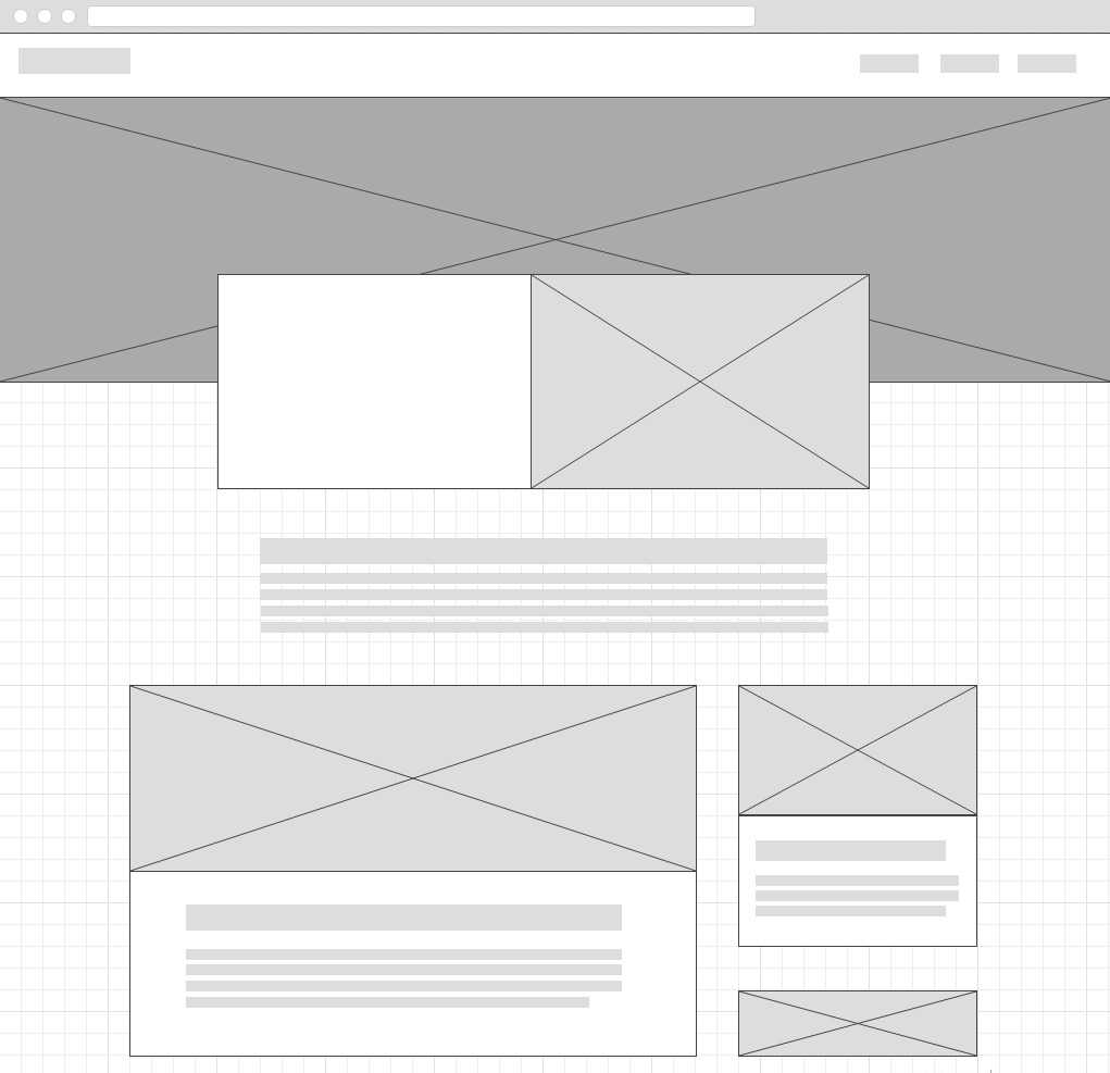
- Avoid flashy graphics and images. Instead, try using simple rectangles and squares as placeholders with an “x” through the middle of the box to show where the image will be placed. Pro tip: You can also do the same thing for videos by using a triangle as a play button at the center of the box.
Wireframe
![]()
Что такое вайрфрейм?
Вайрфрейм — это низко детализированное представление дизайна. Он чётко должен показывать:
- Основные группы содержимого. Что?
- Информационную структуру. Где?
- Описание взаимодействия пользователя с интерфейсом и его примерную визуализацию. Как?
Вайрфрейм — не просто бессмысленный набор серых блоков, хотя это выглядит именно так. Считайте это скелетом вашего дизайна и запомните, что в вайрфрейме должны быть представлены все важные элементы конечного продукта.
«Представлены» — это ключевое слово, которое поможет вам найти правильный баланс между уровнем детализации и скоростью создания
Нельзя уходить в детали, но с другой стороны, нужно создать цельное представление конечного дизайна и не пропустить ни одного важного элемента. Вы описываете фронт работ по проекту для всех задействованных лиц: разработчиков, дизайнеров, копирайтеров, менеджеров — всем им нужен хорошо сработанный вайрфрейм
По сути, вы создаёте карту города. Каждая улица должна на ней быть, но в очень упрощённом виде. Смотря на карту, вы можете оценить планирование города, но не можете увидеть его красоту.
Вайрфреймы должны создаваться быстро и большую часть этого времени следует провести за обсуждениями с командой и размышлениями. Само таскание серых блоков по экрану должно занимать минимум времени.
Внешний вид должен быть эстетичным, но очень простым. Чёрно-серо-белый — типичная палитра вайрфрейма (вы можете добавить синий, чтобы обозначить ссылки).
Если, например, выбор пиктограмм или загрузка картинок занимает слишком много времени, их можно заменить заглушками — накрест перечёркнутыми прямоугольниками с соответствующим описанием. Мы склонны полагать, что вайрфрейм даёт неполное представление о конечном результате.
Запомните, хороший вайрфрейм ложится в основу чистового дизайна и определяет направление работы для всей команды.
Когда использовать вайрфреймы?
Обычно вайрфреймы используются как документация по проекту. Так как они показывают взаимодействие пользователя с интерфейсом в отдельных статичных моментах, их нужно сопровождать текстовыми комментариями: как короткими пояснениями, так и комплексной технической документацией, при необходимости.
Однако они могут использоваться менее формальным способом. Так как они просты и быстро создаются, они, как зарисовки, хорошо подходят для обсуждения внутри команды. Если разработчики спрашивают, как что-то должно быть сделано, ответ может быть дан в виде быстро сделанного вайрфрейма.
Вайрфреймы сложно приспособить для юзабилити-тестирования, хотя они могут пригодиться для получения отзывов во время начального «партизанского» исследования, когда вам срочно требуется озарение и вас не беспокоит методологическая чистота.
В общем процессе дизайна вайрфреймы могут быть неожиданно эффективны и, хоть в последние годы о них отзывались не очень, они остаются важным начальным этапом сложных проектов.


