CSS Справочники
CSS СправочникCSS ПоддержкаCSS СелекторыCSS ФункцииCSS ЗвукCSS Веб шрифтыCSS АнимацииCSS ДлиныCSS Конвертер px-emCSS Названия цветаCSS Значения цветаCSS по умолчаниюCSS Символы
CSS Свойства
align-content
align-items
align-self
all
animation
animation-delay
animation-direction
animation-duration
animation-fill-mode
animation-iteration-count
animation-name
animation-play-state
animation-timing-function
backface-visibility
background
background-attachment
background-blend-mode
background-clip
background-color
background-image
background-origin
background-position
background-repeat
background-size
border
border-bottom
border-bottom-color
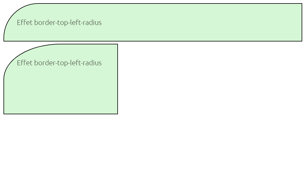
border-bottom-left-radius
border-bottom-right-radius
border-bottom-style
border-bottom-width
border-collapse
border-color
border-image
border-image-outset
border-image-repeat
border-image-slice
border-image-source
border-image-width
border-left
border-left-color
border-left-style
border-left-width
border-radius
border-right
border-right-color
border-right-style
border-right-width
border-spacing
border-style
border-top
border-top-color
border-top-left-radius
border-top-right-radius
border-top-style
border-top-width
border-width
bottom
box-decoration-break
box-shadow
box-sizing
caption-side
caret-color
@charset
clear
clip
color
column-count
column-fill
column-gap
column-rule
column-rule-color
column-rule-style
column-rule-width
column-span
column-width
columns
content
counter-increment
counter-reset
cursor
direction
display
empty-cells
filter
flex
flex-basis
flex-direction
flex-flow
flex-grow
flex-shrink
flex-wrap
float
font
@font-face
font-family
font-kerning
font-size
font-size-adjust
font-stretch
font-style
font-variant
font-weight
grid
grid-area
grid-auto-columns
grid-auto-flow
grid-auto-rows
grid-column
grid-column-end
grid-column-gap
grid-column-start
grid-gap
grid-row
grid-row-end
grid-row-gap
grid-row-start
grid-template
grid-template-areas
grid-template-columns
grid-template-rows
hanging-punctuation
height
hyphens
@import
isolation
justify-content
@keyframes
left
letter-spacing
line-height
list-style
list-style-image
list-style-position
list-style-type
margin
margin-bottom
margin-left
margin-right
margin-top
max-height
max-width
@media
min-height
min-width
mix-blend-mode
object-fit
object-position
opacity
order
outline
outline-color
outline-offset
outline-style
outline-width
overflow
overflow-x
overflow-y
padding
padding-bottom
padding-left
padding-right
padding-top
page-break-after
page-break-before
page-break-inside
perspective
perspective-origin
pointer-events
position
quotes
resize
right
tab-size
table-layout
text-align
text-align-last
text-decoration
text-decoration-color
text-decoration-line
text-decoration-style
text-indent
text-justify
text-overflow
text-shadow
text-transform
top
transform
transform-origin
transform-style
transition
transition-delay
transition-duration
transition-property
transition-timing-function
unicode-bidi
user-select
vertical-align
visibility
white-space
width
word-break
word-spacing
word-wrap
writing-mode
z-index
CSS Properties
align-contentalign-itemsalign-selfallanimationanimation-delayanimation-directionanimation-durationanimation-fill-modeanimation-iteration-countanimation-nameanimation-play-stateanimation-timing-functionbackface-visibilitybackgroundbackground-attachmentbackground-blend-modebackground-clipbackground-colorbackground-imagebackground-originbackground-positionbackground-repeatbackground-sizeborderborder-bottomborder-bottom-colorborder-bottom-left-radiusborder-bottom-right-radiusborder-bottom-styleborder-bottom-widthborder-collapseborder-colorborder-imageborder-image-outsetborder-image-repeatborder-image-sliceborder-image-sourceborder-image-widthborder-leftborder-left-colorborder-left-styleborder-left-widthborder-radiusborder-rightborder-right-colorborder-right-styleborder-right-widthborder-spacingborder-styleborder-topborder-top-colorborder-top-left-radiusborder-top-right-radiusborder-top-styleborder-top-widthborder-widthbottombox-decoration-breakbox-shadowbox-sizingcaption-sidecaret-color@charsetclearclipcolorcolumn-countcolumn-fillcolumn-gapcolumn-rulecolumn-rule-colorcolumn-rule-stylecolumn-rule-widthcolumn-spancolumn-widthcolumnscontentcounter-incrementcounter-resetcursordirectiondisplayempty-cellsfilterflexflex-basisflex-directionflex-flowflex-growflex-shrinkflex-wrapfloatfont@font-facefont-familyfont-kerningfont-sizefont-size-adjustfont-stretchfont-stylefont-variantfont-weightgridgrid-areagrid-auto-columnsgrid-auto-flowgrid-auto-rowsgrid-columngrid-column-endgrid-column-gapgrid-column-startgrid-gapgrid-rowgrid-row-endgrid-row-gapgrid-row-startgrid-templategrid-template-areasgrid-template-columnsgrid-template-rowshanging-punctuationheighthyphens@importisolationjustify-content@keyframesleftletter-spacingline-heightlist-stylelist-style-imagelist-style-positionlist-style-typemarginmargin-bottommargin-leftmargin-rightmargin-topmax-heightmax-width@mediamin-heightmin-widthobject-fitopacityorderoutlineoutline-coloroutline-offsetoutline-styleoutline-widthoverflowoverflow-xoverflow-ypaddingpadding-bottompadding-leftpadding-rightpadding-toppage-break-afterpage-break-beforepage-break-insideperspectiveperspective-originpointer-eventspositionquotesresizerighttab-sizetable-layouttext-aligntext-align-lasttext-decorationtext-decoration-colortext-decoration-linetext-decoration-styletext-indenttext-justifytext-overflowtext-shadowtext-transformtoptransformtransform-origintransform-styletransitiontransition-delaytransition-durationtransition-propertytransition-timing-functionunicode-bidiuser-selectvertical-alignvisibilitywhite-spacewidthword-breakword-spacingword-wrapz-index
Описание
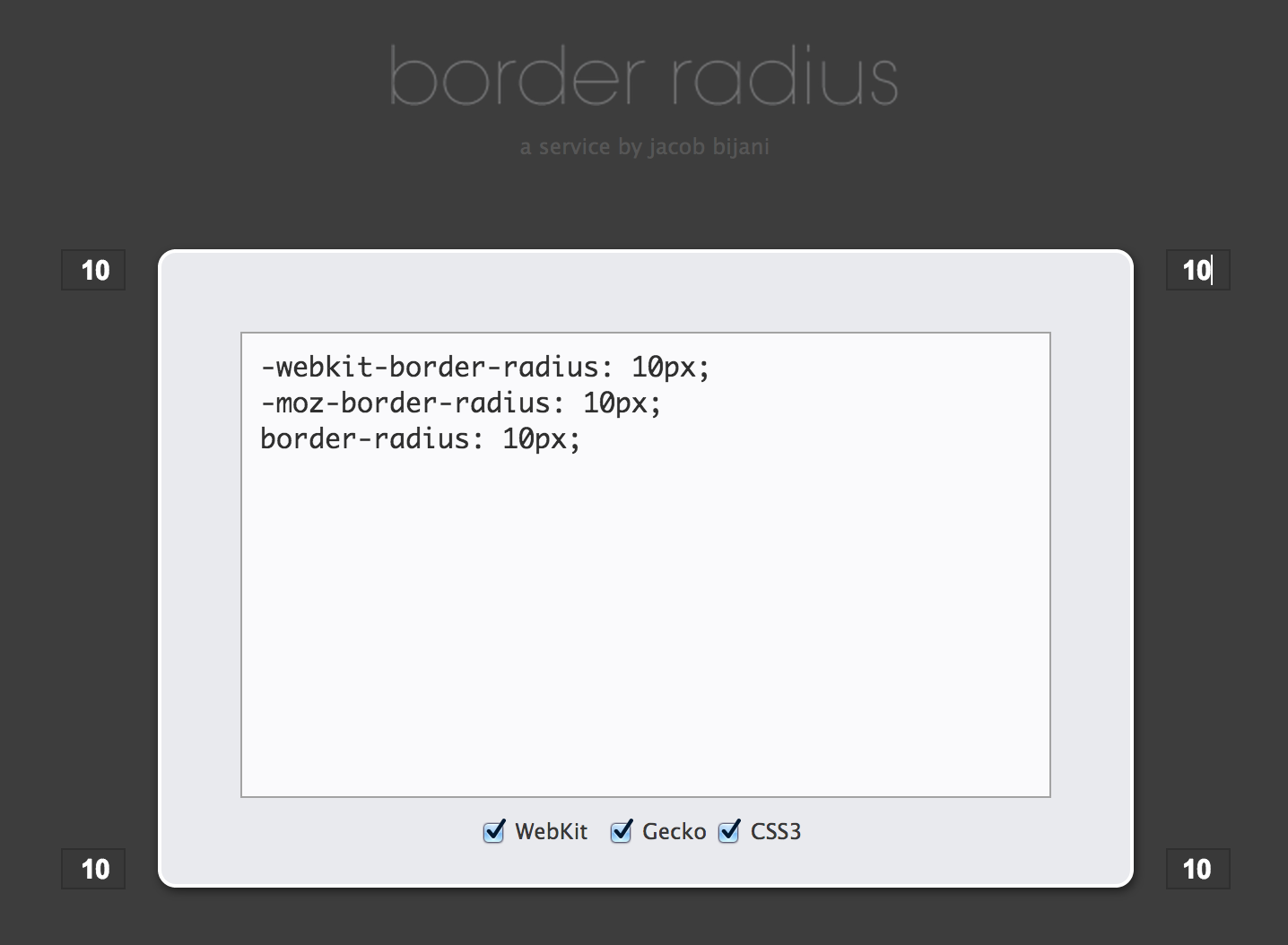
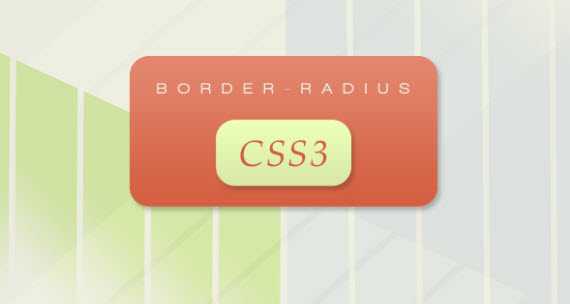
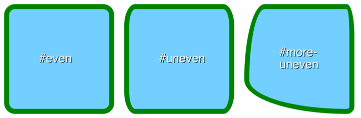
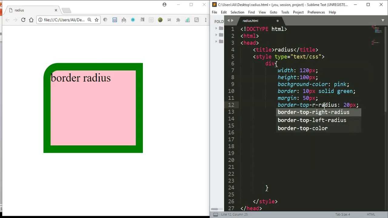
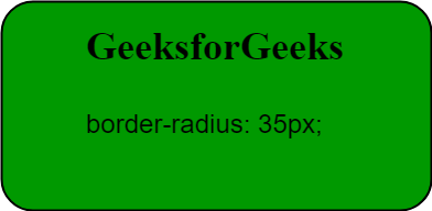
CSS свойство позволяет сделать закруглённую рамку или скруглить углы элемента. Значение свойства определяет радиус окружности. При использовании свойства, вместо отрисовки обычных прямых углов элемента, будет использоваться закруглённая рамка с закруглёнными углами согласно дуге окружности с заданным радиусом:
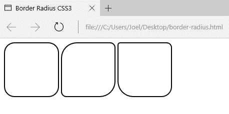
Свойство может содержать от одного до четырёх значений, разделяемых между собой пробелами. От количества значений зависит то, как будут установлены радиусы скругления углов. Если указывается более одного значения, скругление углов устанавливается начиная с верхнего левого угла:
|
|
|
|
|
|
|
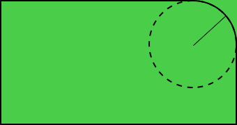
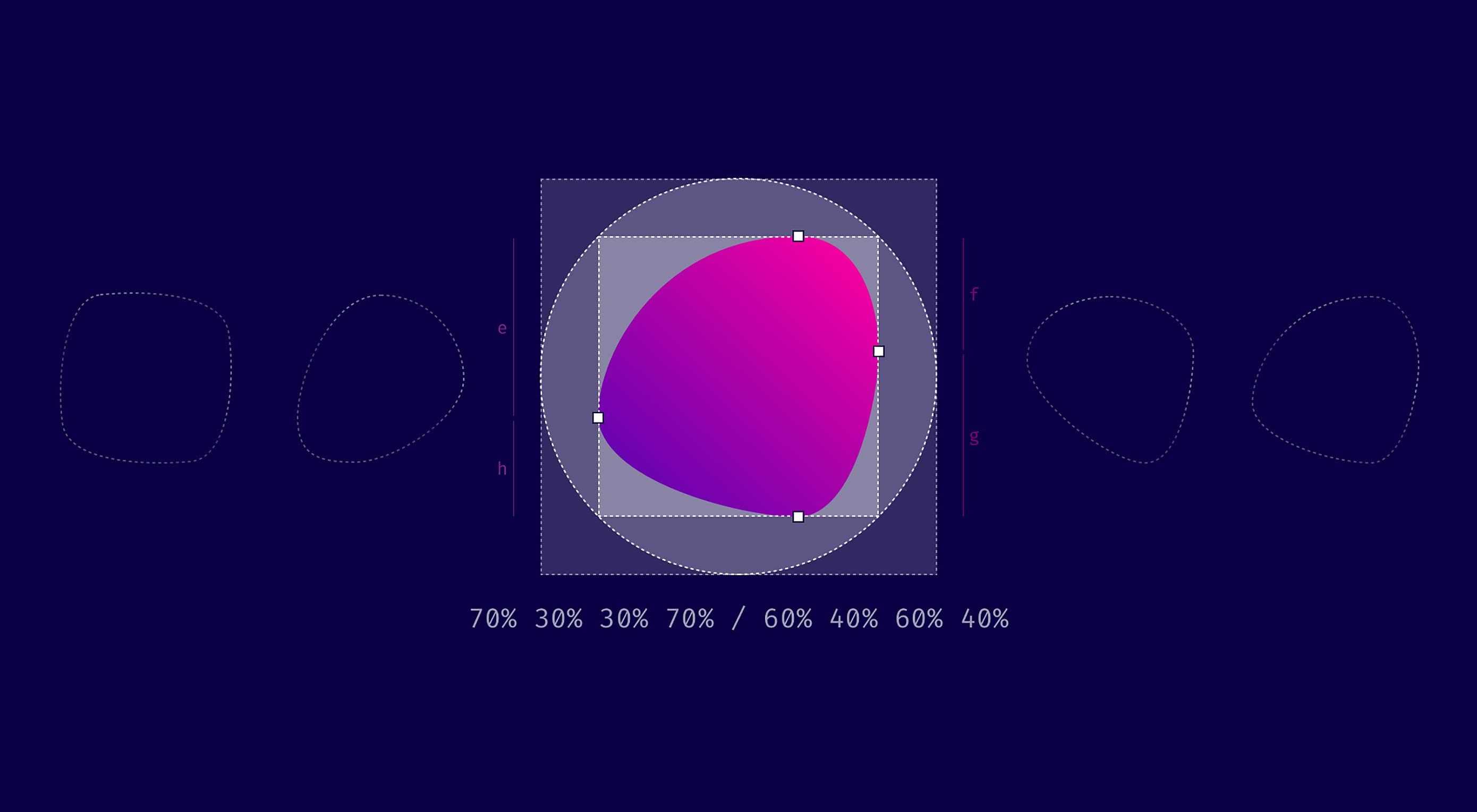
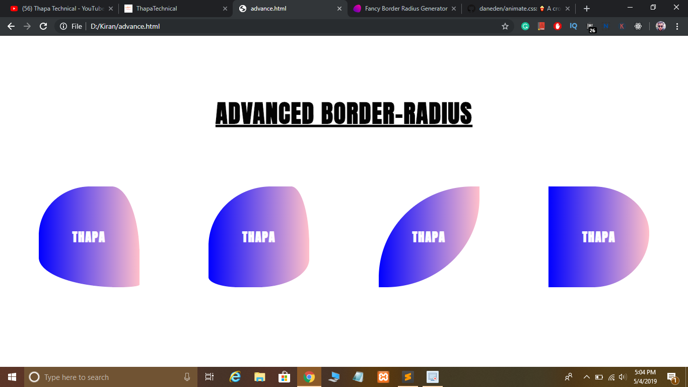
Овальные скругления
CSS свойство также позволяет сделать скругление углов ввиде дуги овала, а не круга:
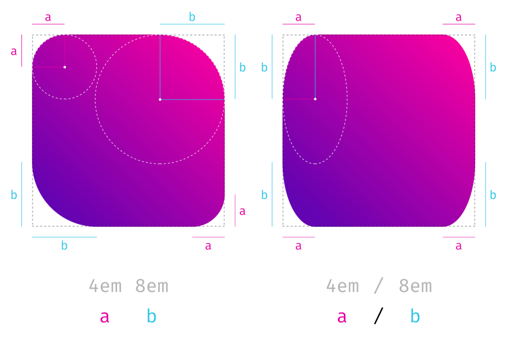
Чтобы определить овал используется комбинация из двух значений, между которыми ставится символ :
border-radius: 50px / 30px;
Значение, расположенное слева от слэша, определяет горизонтальный радиус, значение справа – вертикальный радиус.
Каждая из двух частей (до слэша и после него) подчиняется тем же правилам, что и при создании круглых скруглений. Это означает, что каждая часть может содержать от одного до четырёх значений, разделяемых между собой пробелами. И от количества заданных значений будет зависеть то, как будут установлены радиусы скругления углов. Например, четыре значения перед символом представляют горизонтальные радиусы для верхнего левого, верхнего правого, нижнего правого и нижнего левого углов. Значения после символа соответственно представляют вертикальные радиусы для тех же самых углов.
Пример с овальными скруглениями:
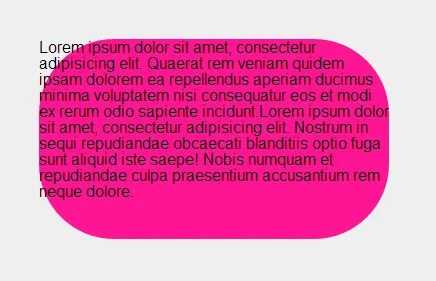
|
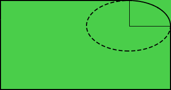
Важно понимать, что форма элемента в любом случае остаётся прямоугольной. Поэтому, несмотря на то, что браузер отрисовывает закруглённые углы для элемента, содержимое элемента всё равно размещается в прямоугольной области и может выходить за границы скруглённых углов:
Примечание: если у элемента нет рамки, то браузер будет производить скругление углов для фоновой области.
| Значение по умолчанию: | |
|---|---|
| Применяется: | ко всем элементам, кроме элемента table, когда для него установлено border-collapse: collapse; |
| Анимируется: | да |
| Наследуется: | нет |
| Версия: | CSS3 |
| Синтаксис JavaScript: | object.style.borderRadius=»5px» |
Definition and Usage
The property defines the radius of the
element’s corners.
Tip: This property allows you to add rounded corners to elements!
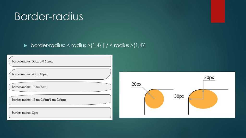
This property can have from one to four values. Here are the rules:
Four values — border-radius: 15px 50px 30px 5px; (first value applies to top-left
corner, second value applies to top-right corner, third value applies to bottom-right corner, and fourth value applies to bottom-left corner):
Three values — border-radius: 15px 50px 30px; (first value applies to top-left
corner, second value applies to top-right and bottom-left corners, and third value applies to bottom-right corner):
Two values — border-radius: 15px 50px; (first value applies to top-left and bottom-right corners, and the second value applies to top-right and bottom-left corners):
One value — border-radius: 15px; (the value applies to all four corners, which are rounded equally:
| Default value: | |
|---|---|
| Inherited: | no |
| Animatable: | yes. Read about animatable Try it |
| Version: | CSS3 |
| JavaScript syntax: | object.style.borderRadius=»25px» Try it |
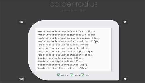
New short-hand properties
The following syntax is now working in Firefox and Opera allowing you
to specify not only matching elliptical corners, but also different
elliptical corners in one shorthand property.
Here we’ve recreated two of the WebKit examples above using the new
syntax. You can see that the individual corner settings work exactly
the same now in Firefox as in WebKit, but for the short-hand property
you need to include a slash:
Example 8
Example 9
And now to the scary part.
Using the short-hand property, all values before the slash apply to the
horizontal radii and all values afterwards to the vertical. In this
example we’ve created a hybrid of the previous two examples.
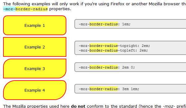
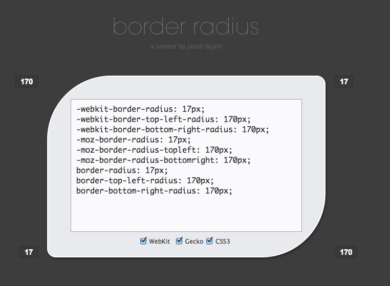
Example 10
Here you can see what these
boxes look like in Firefox 3.5:
With all major browsers now using the same syntax, the
vendor-prefixes have been dropped and the standard seems to be set in
stone.
Общая информация и примечания
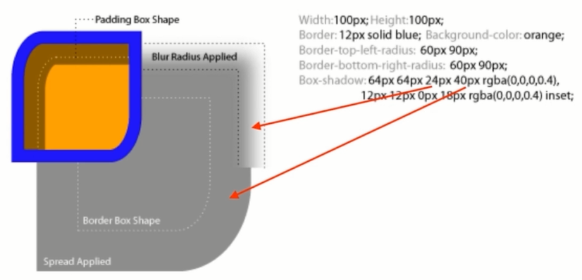
Если элемент использует фоновый цвет или изображение, фон также будет обрезаться указанным радиусом границы:
Фоновое изображение элемента обрезается в соответствии с указанным радиусом границы.
Но иногда цвет фона элемента может «просачиваться
» за пределы границы, когда она закруглена. Чтобы исправить это, можно использовать свойство background-clip
и установить для него значение padding-box
.
Element {
border-radius: 30px;
background-clip: padding-box;
}
Если у элемента есть границы изображения, то они не подрезается кривой закругленных углов.
Содержимое элемента может выходить за его границы в углах, которые были закруглены, если для элемента не установлено значение отступа, достаточное, чтобы сместить содержимое внутрь:
Содержимое элемента может выходить за закругленную границу, если для элемента не заданы отступы.
В этом примере moz border radius CSS
добавлены отступы, чтобы содержимое не выходило за закругленные углы границы
Обратите внимание, что сама граница не отображается, но фон все равно будет иметь закругленные углы
Element {
background: black;
color: white;
border-radius: 1em;
padding: 1em;
}
Кроме этого область вне кривой границы не принимает pointer events
, связанные с данным элементом.
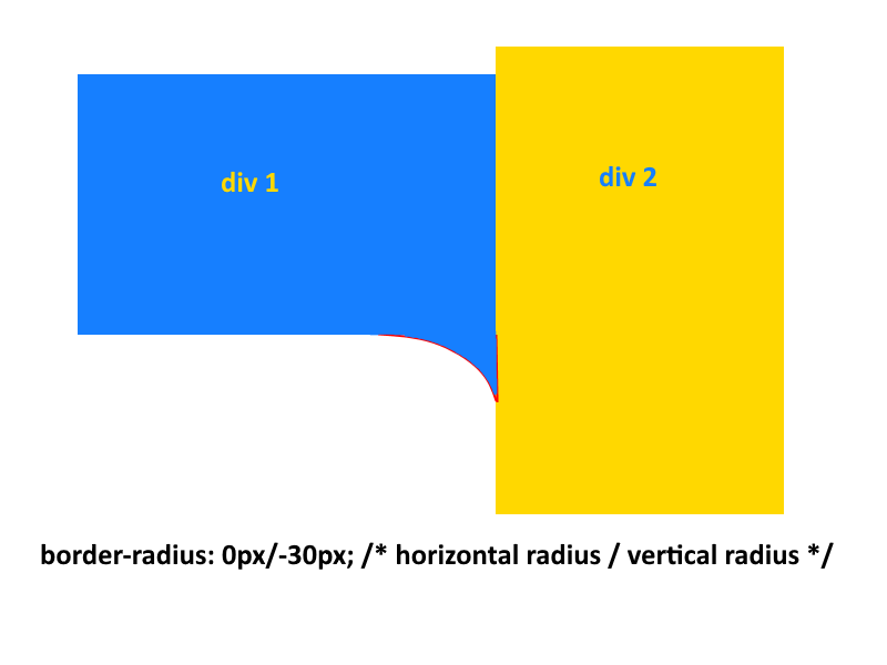
Также кривые углов не должны пересекаться: когда сумма радиусов любых двух соседних границ превышает размер блока, браузеры должны пропорционально уменьшить используемые значения всех радиусов границ, чтобы ни один из них не перекрывался.
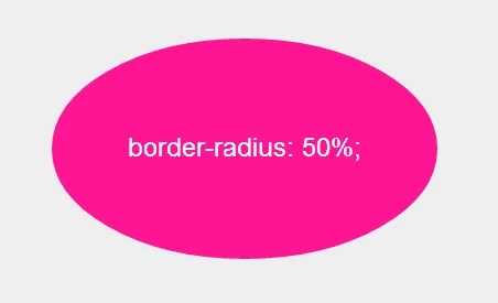
Процентные значения идеально подходят для создания круглых или эллиптических форм. Использование border radius CSS: 50%
дает полностью круглую форму элемента, у которого высота и ширина равны:
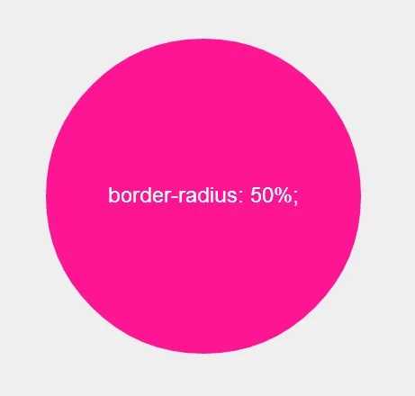
Элемент с одинаковой высотой, шириной и значением радиуса границы 50%.
Если высота и ширина элемента не равны, мы получим эллиптическую форму:
Элемент с радиусом границы 50%, высота и ширина которого не равны.
Официальный синтаксис
Синтаксис:
border-radius: {1,4} {1,4}]?
Начальное значение:
0 0 0 0, оно задает начальное значения каждого из отдельных свойств.
Применяется:
ко всем элементам. Но браузеры не обязательно должны применять его к элементам table
и inline-table
, когда для свойства border-collapse
задано значение collapse
. На данный момент поведение внутренних элементов таблицы не определено.
Анимируется:
Каждое из полных свойств анимируется, как два значения длины, процентных значения или значения calc()
. Когда оба значения являются длинами, они интерполируются как длины. Когда оба значения являются процентами, они интерполируются в процентах. Иначе оба значения преобразуются свойством calc()
.
Значения
Неофициальный синтаксис webkit border radius CSS
:
border-radius: ? ? ?;
border-radius: ? ? ? / ? ? ?
В обоих случаях вопросительный знак (?)
означает, что значение является необязательным. Если значение опущено, браузер определяет его, как описано выше.
Каждый радиус может задаваться процентами или значением длины. Процентное соотношение для горизонтального радиуса относится к ширине блока, тогда как процентное соотношение для вертикального радиуса относится к высоте блока. Отрицательные значения не допускаются.
border-radius: 50%;
border-radius: 30px 20px 40px;
border-radius: 1em 2em;
border-radius: 3em / 2em 4em;
border-radius: 1em 2em 1em 3em / 2em 3em;
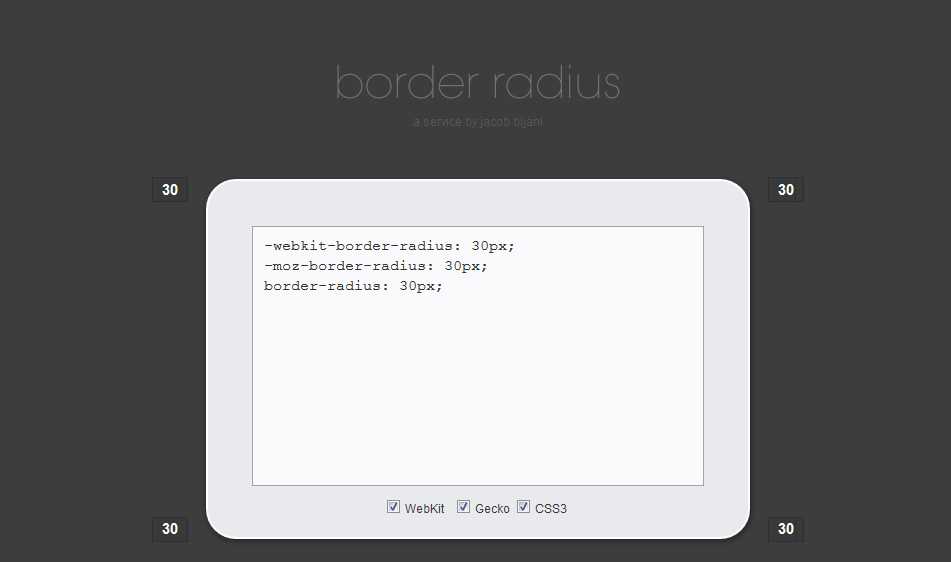
Демо-версия
Устанавливает радиус скругления уголков рамки. Если рамка не задана, то скругление также происходит и с фоном.
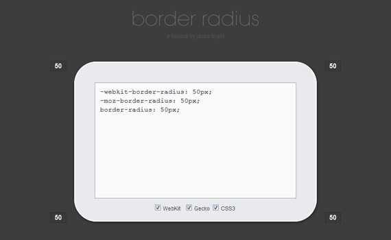
Definition and syntax for border-radius
As with many CSS properties relating to margins, padding and borders,
there are four individual properties — one for each corner of a box
element — and one shorthand property. Each of the corner attributes
will accept either one or two values. The border-radius
property will accept up to two values in WebKit browsers and up to eight
now in Firefox 3.5.
Here are the CSS and browser-specific attributes in question:
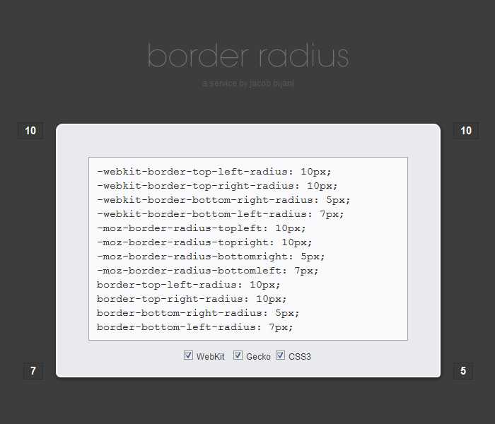
| CSS3 | Mozilla equivalent | WebKit equivalent |
|---|---|---|
| border-top-right-radius | -moz-border-radius-topright | -webkit-border-top-right-radius |
| border-bottom-right-radius | -moz-border-radius-bottomright | -webkit-border-bottom-right-radius |
| border-bottom-left-radius | -moz-border-radius-bottomleft | -webkit-border-bottom-left-radius |
| border-top-left-radius | -moz-border-radius-topleft | -webkit-border-top-left-radius |
| border-radius | -moz-border-radius | -webkit-border-radius |
Prior to IE9 these CSS3 properties do not work in Internet
Explorer. The ‘Mozilla’ versions however work perfectly well in
Firefox and other Mozilla-based browsers and the ‘WebKit’ ones in Safari
and Chrome as well as the iPhone/iPad.
Each of the individual corner CSS3 properties take either one or two
length values (generally ‘px’ or ’em’ values). If a single value
is supplied then that becomes the radius of a rounded corner. If two
values are supplied then they become the horizontal and vertical radii
for an elliptical corner.
The Mozilla syntax before Firefox 3.5 only supported round (as
opposed to elliptical) corners and adding a second value would result in
a standard square corner.
The border-radius property in WebKit accepts one or two
values and uses them to style all four corners making a nice symmetric
shape. The allows you to
define four different round or elliptical corners. A slash has been
introduced to separate the horizontal and vertical length
settings.
There is no pure-CSS solution for rounded corners in IE8 or other
primitive browsers. Only a range of JavaScript patches which can be
found by searching online.
CSS Properties
align-contentalign-itemsalign-selfallanimationanimation-delayanimation-directionanimation-durationanimation-fill-modeanimation-iteration-countanimation-nameanimation-play-stateanimation-timing-functionbackface-visibilitybackgroundbackground-attachmentbackground-blend-modebackground-clipbackground-colorbackground-imagebackground-originbackground-positionbackground-repeatbackground-sizeborderborder-bottomborder-bottom-colorborder-bottom-left-radiusborder-bottom-right-radiusborder-bottom-styleborder-bottom-widthborder-collapseborder-colorborder-imageborder-image-outsetborder-image-repeatborder-image-sliceborder-image-sourceborder-image-widthborder-leftborder-left-colorborder-left-styleborder-left-widthborder-radiusborder-rightborder-right-colorborder-right-styleborder-right-widthborder-spacingborder-styleborder-topborder-top-colorborder-top-left-radiusborder-top-right-radiusborder-top-styleborder-top-widthborder-widthbottombox-decoration-breakbox-shadowbox-sizingbreak-afterbreak-beforebreak-insidecaption-sidecaret-color@charsetclearclipclip-pathcolorcolumn-countcolumn-fillcolumn-gapcolumn-rulecolumn-rule-colorcolumn-rule-stylecolumn-rule-widthcolumn-spancolumn-widthcolumnscontentcounter-incrementcounter-resetcursordirectiondisplayempty-cellsfilterflexflex-basisflex-directionflex-flowflex-growflex-shrinkflex-wrapfloatfont@font-facefont-familyfont-feature-settingsfont-kerningfont-sizefont-size-adjustfont-stretchfont-stylefont-variantfont-variant-capsfont-weightgapgridgrid-areagrid-auto-columnsgrid-auto-flowgrid-auto-rowsgrid-columngrid-column-endgrid-column-gapgrid-column-startgrid-gapgrid-rowgrid-row-endgrid-row-gapgrid-row-startgrid-templategrid-template-areasgrid-template-columnsgrid-template-rowshanging-punctuationheighthyphensimage-rendering@importisolationjustify-content@keyframesleftletter-spacingline-heightlist-stylelist-style-imagelist-style-positionlist-style-typemarginmargin-bottommargin-leftmargin-rightmargin-topmask-imagemask-modemask-originmask-positionmask-repeatmask-sizemax-heightmax-width@mediamin-heightmin-widthmix-blend-modeobject-fitobject-positionopacityorderorphansoutlineoutline-coloroutline-offsetoutline-styleoutline-widthoverflowoverflow-wrapoverflow-xoverflow-ypaddingpadding-bottompadding-leftpadding-rightpadding-toppage-break-afterpage-break-beforepage-break-insideperspectiveperspective-originpointer-eventspositionquotesresizerightrow-gapscroll-behaviortab-sizetable-layouttext-aligntext-align-lasttext-decorationtext-decoration-colortext-decoration-linetext-decoration-styletext-decoration-thicknesstext-indenttext-justifytext-overflowtext-shadowtext-transformtoptransformtransform-origintransform-styletransitiontransition-delaytransition-durationtransition-propertytransition-timing-functionunicode-bidiuser-selectvertical-alignvisibilitywhite-spacewidowswidthword-breakword-spacingword-wrapwriting-modez-index
Possible Values
The possible values for this property are:
{1,4} [ / {1,4} ]?
Explanation of the Values
- <length>
- Specifies the radius using a fixed length, for example, .
- <percentage>
- Specifies the radius using a percentage value, for example, .
Explanation of the Syntax
You can provide between one and eight values. Here’s an explanation:
- If you provide only one value, it will determine the radius of all four corners — both the horizontal radius and the vertical radius.
- The values must be provided in the following order: top-left, top-right, bottom-right, and bottom-left. If the value for bottom-left is omitted it will be the same as the value for top-right. If the value for bottom-right is omitted it will be the same as the value for top-left. If top-right is omitted it will be the same as top-left.
- To set a different radius for horizontal vs vertical, use a forward-slash to separate them ( ). The values on the left side of the forward-slash determine the horizontal radius. The values on the right side of the forward-slash determine the vertical radius. Up to four values per side are accepted (i.e. one for each corner).
In addition, all CSS properties also accept the following CSS-wide keyword values as the sole component of their property value:
- Represents the value specified as the property’s initial value.
- Represents the computed value of the property on the element’s parent.
- This value acts as either or , depending on whether the property is inherited or not. In other words, it sets all properties to their parent value if they are inheritable or to their initial value if not inheritable.
Mobile Safari and border-radius issues
Mobile Safari on the iPhone and iPad* have some rendering issues when it comes to border-radius which result in a line appearing just below the top border. Depending on the ratio of the radius to the height of the box it may appear the full width of the input or just inside it. Either way, it looks a little messy.
Thanks to this post on StackOverflow, it appears easy enough to solve: simply ensure the radius is no more than half the height of the input and add «-webkit-appearance: none;» as one of the properties to the style. Then it renders nicely.
(*and possibly Android. I didn’t test as by then it was working nicely on mobile devices).