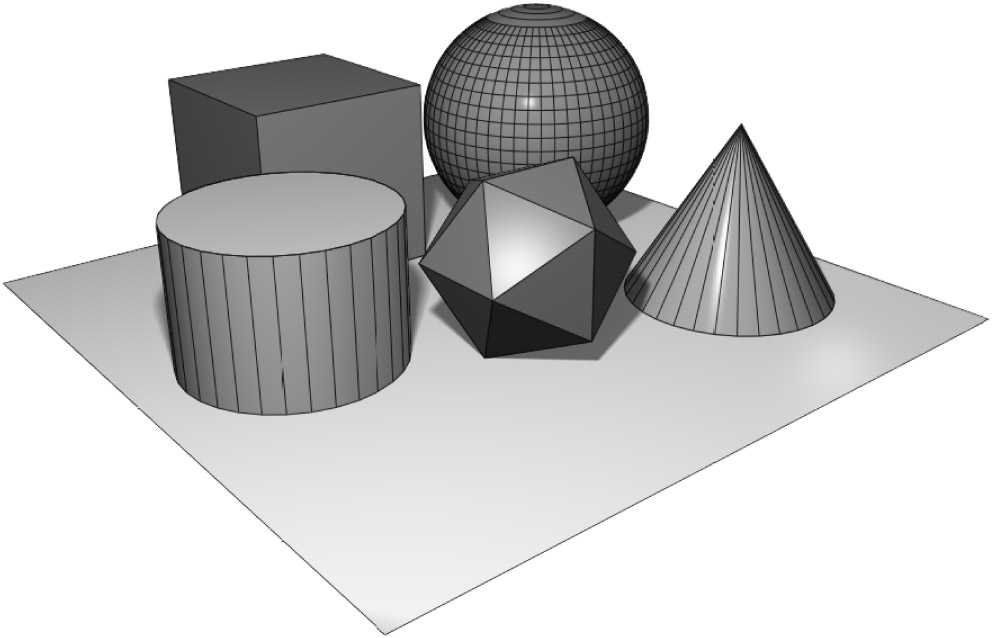
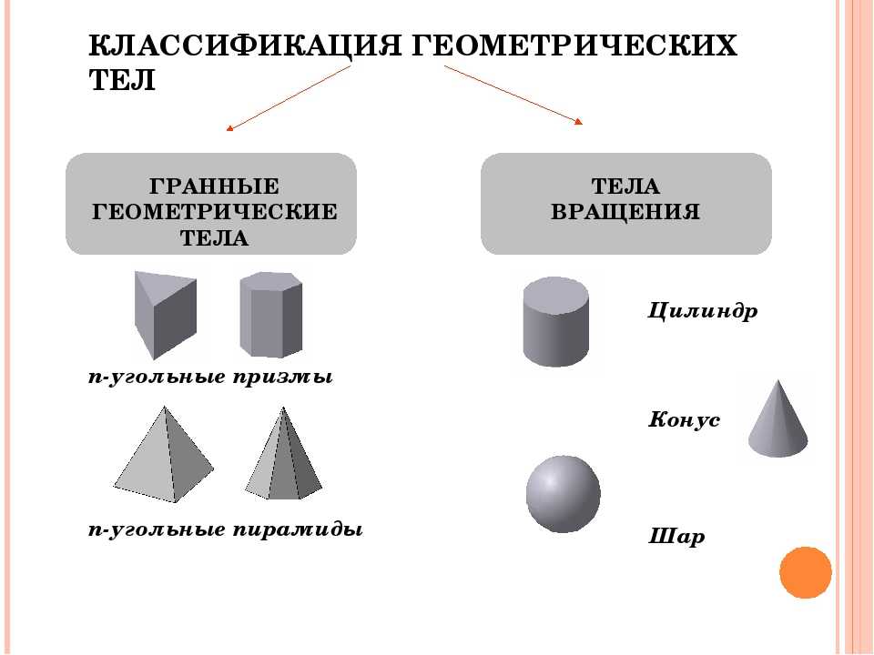
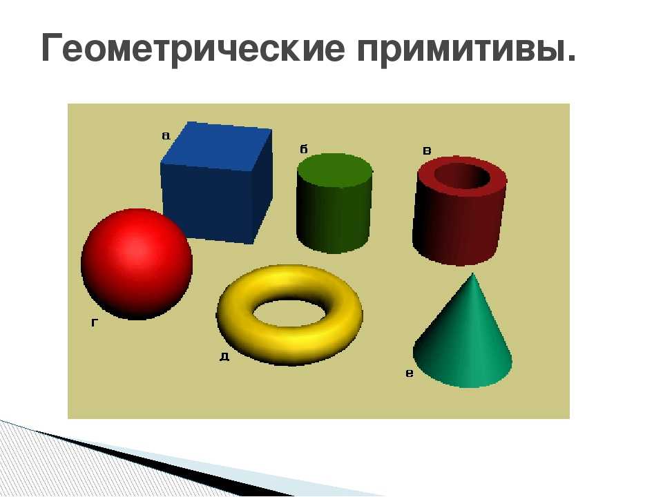
Определение основных форм
Свойство позволяет нам определять форму. Он принимает различные значения, каждый из которых определяет различные формы, указанные в типе данных . Мы можем начать с рассмотрения очень простого случая.
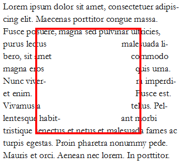
В следующем примере у меня есть изображение с плавающей слева. Затем я применил к нему свойство со значением . В результате содержимое теперь изгибается вокруг круглой формы, а не следует за прямоугольником, созданным прямоугольником изображения.
Как и на этом уровне спецификации, элемент должен быть плавающим, чтобы применить к нему ; у этого есть побочный эффект создания простого отступления для многих случаев. Если у вас нет поддержки Shapes в браузере, пользователь увидит, как содержимое течет по сторонам прямоугольника, как и раньше. Если у них есть поддержка форм, улучшается визуальное отображение.
Основные формы
значений (50%) является примером базовой формы. Спецификация определяет четыре значения , которые:
Использование значения оборачивает текст вокруг прямоугольной формы, однако вы можете добавлять значения смещения, тем самым вытягивая линейные блоки любого содержимого переноса ближе к объекту, чем это могло бы произойти в противном случае.
Мы уже видели, как создает круглую форму. является по существу раздавленным кругом. Если ни одна из этих простых фигур не помогает, вы можете создать и сделать фигуру настолько сложной, насколько вам нужно.
В нашем Руководстве по базовым фигурам мы рассмотрим каждую из возможных базовых фигур и способы их создания.
Формы из «Значения ящика
Фигуры также можно создавать вокруг Box Value,поэтому вы можете создать свою фигуру на ней:
В приведенном ниже примере вы можете изменить значения на любое другое допустимое значение, чтобы увидеть, как форма перемещается ближе или дальше от рамки.
Чтобы изучить значения прямоугольников более подробно, см. Наше руководство, посвященное фигурам из значений прямоугольников .
Формы из изображений
Интересный способ создать свой путь — использовать изображение с альфа-каналом — текст затем будет обтекать непрозрачные части изображения. Это позволяет наложить обернутый контент вокруг изображения или использовать изображение, которое никогда не отображается на странице, просто как метод создания сложной формы без необходимости аккуратно отображать многоугольник.
Обратите внимание, что изображения, используемые таким образом, должны быть совместимы с CORS , иначе будет действовать так, как если бы них не было указано в качестве значения, и вы не получите форму. В следующем примере у нас есть изображение с полностью прозрачной областью, и мы используем изображение в качестве значения URL для
Форма создается вокруг непрозрачной области — изображение воздушного шара
В следующем примере у нас есть изображение с полностью прозрачной областью, и мы используем изображение в качестве значения URL для . Форма создается вокруг непрозрачной области — изображение воздушного шара.
Свойство используется для установки порога прозрачности изображения, используемого для определения области изображения, используемой для фигуры. Если значение равно (что является начальным значением), тогда область должна быть полностью прозрачной. Если значение равно тогда оно полностью непрозрачно. Значения между ними означают, что вы можете установить полупрозрачную область в качестве определяющей области фигуры.
Порог в действии можно увидеть,если мы используем градиент в качестве изображения,на котором определяется наша фигура.В примере ниже,если вы измените порог,то путь,по которому проходит фигура,изменится в зависимости от выбранного вами уровня непрозрачности.
Мы более подробно рассмотрим создание фигур из изображений в руководстве « Формы из изображений» .
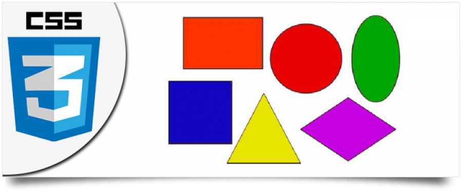
CSS Shapes — The basic way
By using a few tricks in CSS we’ve always been able to create basic shapes like squares, circles, and triangles with regular CSS properties. Let’s look at a few of them now.
Squares and rectangles
Squares and rectangles are probably the easiest shapes to achieve. By default, a div is always a square or a rectangle.
You set the width and height as shown in the below code. Then it’s just a matter of giving the element a background color. You can have whatever other properties you want on the element.
A CSS square
Circles
It’s almost as easy to create a circle. To create a circle we can set the border-radius on the element. This will create curved corners on the element.
If we set it to 50% it will create a circle. If you set a different width and height we will get an oval instead.
A CSS Circle
Triangles
Triangles are a little trickier. We have to set the borders on the element to match a triangle. By setting the width and height to zero on the element, the actual width of the element is going to be the width of the border.
Keep in mind that the border edges on an element are 45 degree diagonals to each other. That’s why this method works to create a triangle. By setting one of the borders to a solid color and the other borders to transparent it will take the form of a triangle.
CSS Borders have angled edges
A CSS Triangle
If you want to have a triangle/arrow pointing in another direction You can change the border values corresponding to what side you want to be visible. Or you can rotate the element with the transform property if you want to be really fancy.
Another CSS Triangle
Alright – that’s an intro to basic shapes with CSS. There are probably an endless amount of shapes you can think of to create. These are just the fundamentals, but with a little creativity and determination you can achieve a lot with just basic CSS properties.
In some cases, with more advanced shapes, it’s also a good idea to use the :after and :before pseudo selectors. This is out of scope of this article though as my intention is to cover the basics to get you going.
Disadvantage
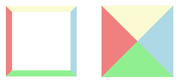
There is one big disadvantage with the above approach. For example, if you want your text to flow around and wrap your shape. A regular HTML div with background and borders to make up the shape won’t allow that. The text will not adapt and flow around your shape. Instead it will flow around the div itself (which is a square or a rectangle).
Below is an illustration showing the triangle and how the text will flow.
Luckily we have some modern CSS properties to use instead.
Progressive enhancement
Start off by assuming that the browser does not have CSS Shapes support and build up on that when you do detect the feature. Modernizr is a good solution to do feature detection and there is a test for CSS Shapes in the section.
Some browsers provide feature detection in CSS via the rule without the need for external libraries. Google Chrome, which also supports CSS Shapes, understands the rule. This is how you use it to progressively enhance:
.element{
  /* styles for all browsers */
}

@supports (shape-outside: circle(50%)){
  /* styles only for browsers which support CSS Shapes */
  .element{
    shape-outside: circle(50%);
  }
}
Lea Verou has written more about how to use the CSS @supports rule.
The inset() function
The shape function allows you create rectangular shapes around which to wrap content. This might sound counter-intuitive considering the initial premise that CSS Shapes free web content from simple boxes. It may very well be. I have yet to find a use case for which isn’t already achievable with floats and margins or with a . Though does provide a more readable expression for rectangular shapes than .
The full notation for an inset shape function is . The first four position arguments are offsets inwards from the element’s edges. The last argument is the border radius for the rectangular shape. It is optional, so you can leave it out. It follows the shorthand notation you already use in CSS.
.element{
  shape-outside: inset(100px 100px 100px 100px);
  /* yields a rectangular shape which is 100px inset on all sides */
  float: left;
}
Browser Support
Let’s start with the bad news. What kind of browser support do CSS Shapes have right now? Not much at all. There are currently two options for getting css shapes to work and those are Chrome Canary and Webkit Nightly, neither of which is meant to replace your every day browser.
If you don’t have either currently installed, grab one or both. Click on the link above for instructions on setting the correct flag in Canary. Webkit should work out of the box. I’ve only used Chrome Canary myself so far and can’t say for certain how everything below works in Webkit Nightly, but I have no reason to doubt that it works the same way.
Раскрывающийся список (select)
Элемент <select> создает на веб-странице раскрывающийся список (также называемый раскрывающимся или выпадающим меню), позволяющий выбрать одно значение из множества возможных.
Как и в рассмотренных других элементах формы, элементу <select> назначается уникальное имя, с помощью атрибута name. Элемент <select> работает в паре с элементом <option>, создающим меню. Элемент <option> задается для каждого пункта меню. Текст, расположенный между тегами <option> и </option>, будет выведен в окне браузера как пункт раскрывающегося списка.Атрибут value используется в каждом элементе <option> для установки значения, которое будет отправлено на сервер вместе с именем выбранного элемента. Указав для элемента <option> атрибут selected, вы сделаете его значением по умолчанию для данного списка. При загрузке страницы такие элементы будут выделены. Если атрибут selected не установлен, то при загрузке страницы будет отображен первый вариант ответа из созданного списка. Если пользователь не выберет другой пункт списка, то на сервер будет отправлен пункт, отмеченный атрибутом selected по умолчанию:
Grid Layout (Макет Сетки)
Grid Layout позволяет устанавливать гибкую сетку дизайна для
элемента так, чтобы относительно этой сетки можно было бы
расположить потомков этого элемента, и тем самым выровнять их друг
относительно друга в двух размерах. Областям сетки могут быть
присвоены названия, как для простоты использования, так и для
создания уровня обходных путей, который облегчает изменение порядка
элементов. Как и другие модули (grid/template), этот модуль
основывается на идеях frame-based
(основанного на кадрах) макета который ввели в 1996 году и
который, между прочим, внедрил абсолютное позиционирование во 2-ом
Уровне CSS. Таким образом модуль Grid Layout широко взаимодействует
с и но не заменяет их. Однако, в конечном итоге
ожидается, что шесть модулей будут сжаты до трех: Multi-column,
Flexible Box, и третий для grids/templates/regions.
CSS Device Adaptation (Адаптация Прибора в CSS)
CSS Device Adaptation
определяет (1) как начальный блок контента относится к
viewport (порту просмотра) и (2) как единицы CSS (‘px’
(пиксель), ‘cm’ (сантиметр), ‘pt’ (пункт), и другие.) соотносимы с
реальными единицами. Начальный блок контента — это гипотетический
прямоугольник в модели CSS рендеринга, который определяет позицию
(0,0) и значение процентов в корневом элементе. В 2-м уровне CSS он
равен viewport (то есть окно или страница, на которой составляется
документ). Этот модуль определяет правило ‘@viewport’, которое
позволяет увеличивать или уменьшать начальный блок контента по
отношению к viewport. Он также может установить коэффициент
масштабирования, чтобы изменить отображение между единицами CSS и
реальными единицами. (‘@viewport’ как правило, не является полезным
для авторов, но это правило позволяет читателям избавиться от
влияния любого элемента <META NAME=VIEWPORT> что может
встретиться в HTML5 документах.)
shape-inside[Bearbeiten]
Mit der Eigenschaft shape-inside soll es zukünftig möglich sein, Elemente zu definieren, in die Text passgenau eingefügt wird. Im Augenblick wird von einer Implementation in heutige Browser aber abgesehen.
Es würden die gleichen Angaben wie bei shape-outside möglich sein.:
Beachten Sie:
- Die shape-inside-Eigenschaft soll auch mit gefloateten Elementen angewandt werden können.
- Shape-inside wirkt aber nicht bei Elementen, die mit formatiert wurden.
shape-paddingBearbeiten
Die Eigenschaft shape-padding legt zukünftig einen (Innen-)Abstand im umflossenen Objekt fest.
← float und clear
Ausrichtung mit CSS(Übersicht)
Stapelkontext mit z-index →
The ellipse() function
Ellipses look like squished circles. They are defined as , where and are the radii for the ellipse on the X-axis and Y-axis, while and are the coordinates for the center of the ellipse.
.element{
  shape-outside: ellipse(150px 300px at 50% 50%);
  width: 300px;
  height: 600px;
}
Percentage values will be computed from the dimensions of the coordinate system. No funny maths required here. You can omit the coordinates for the ellipse center and they will be inferred from the center of the coordinate system.
Radii on the X and Y axes may also be defined with keywords: yields a radius equal to the distance between the ellipse center and the side of the reference box farthest away from it, while means the exact opposite — use the shortest distance between the center and a side.
.element{
  shape-outside: ellipse(closest-side farthest-side at 50% 50%);
  /* identical to: */
  shape-outside: ellipse(150px 300px at 50% 50%);
  width: 300px;
  height: 600px;
}
This may come in handy when the element’s dimensions (or the reference box) may change in unpredictable ways, but you want the ellipse shape to adapt.
The same and keywords can also be used for the radius in the shape function.
Combine a Few Ideas and Explore!
Don’t be fooled by the ye olde illustrations in my examples — the spec can be used for more modern looking designs with photos and such too:
See it on CodePen (this demo is too awkward for an embed).
Soon enough the web will be buzzing with all sorts of shapes! Designers shall rejoice and developers shall breathe a sigh of relief that finally they can do things their print friends have been doing for years.
Please do get involved, experiment, and share your findings to help develop the spec into something we can use confidently and happily in the future. You can provide feedback to the W3C here, or get in touch with the Adobe Web Platform team.
CSS Reader Media Type (Считыватель медиа в CSS)
Этот модуль был запущен в марте 2008 года. Ключевое
слово ‘reader’ (считыватель) — медиа тип для использования в Media
Queries (Медиа Запросах) (похожий на ‘screen’ (экран), ‘print’
(печать), ‘projection’ (проекция), и т.д.). Устройства, которые
могут применять по своему усмотрению правила внутри ‘@ media
reader’ — это устройства, которые похожи на экранные считыватели,
что отображают страницы на экране и одновременно озвучивают их, или
же отображают страницу и одновременно передают ее на динамическое
устройство Брайля. Свойства, что применяются к этому медиа типу
являются сочетанием свойств экрана, речи и Брайля.
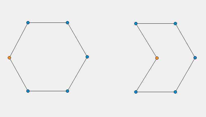
Creating a Polygon
Beyond simple shapes like circles and rectangles we can also create polygons; shapes consisting of multiple (typically five or more) sides, such as a pentagon or a hexagon. To create one, we use the CSS function which takes multiple comma-separated value defining the shape coordinates:
With the above code, we have added five coordinates, thereby generating a pentagon shape. Adding another coordinate to the function will turn the shape into a hexagon, one more for a heptagon, another for an octagon, and so on.
Creating a polygon shape manually is not as easy as creating a circle or an ellipse, especially if the polygon is complex and involves dozens of coordinates. Luckily, there is a handy tool which makes creating CSS Shapes more intuitive.
shape-outside[Bearbeiten]
Mit der Eigenschaft shape-outside wird ein Element definiert, um das Text herumgeführt wird.
Folgende Angaben sind möglich:
- : die gefloatete Form beeinflusst den Textfluss nicht
- SVG-ähnliche Grundformen:
- : eine kreisförmige Form, z. B.:Kreis mit 50% Radius, dessen Mittelpunkt nicht in der linken oberen Ecke des äußeren Elements, sondern im äußeren Element ist.
- ellipse(): eine ovale Form, z.B:
- inset(): legt eine rechteckige Form an, die abgerundet werden kann, z. B.:
- : legt Form mit beliebig vielen Fixpunkten an
- : URI eines Bildes mit Transparenzen, dessen Form umflossen wird
Beachten Sie: funktioniert nur, wenn Dateien und Bilder aus der gleichen Quelle stammen. Dies kann nur bei Dateien, die von einem Webserver ausgeliefert werden, überprüft werden; nicht jedoch von lokal geöffneten Dateien. -
: Festlegung einer Referenz-Box
- : Box mit Außenrändern
- : Box mit Rändern
- : Box mit Innenabstand
- : Box, in der nur der Inhalt zur Festlegung dient.
shape-outside: (circle)Bearbeiten
Haben Sie den roten Kreis oben bemerkt?
Funktionsweise von CSS-Shapes
ansehen …
#shape {
    border-radius 50%;
    float left;
    shape-outside circle(50% at 50% 50%) border-box;
	shape-margin 1.5em;
	margin 1.5em;
	width 12em;
	height 12em;
  }
Er besteht aus zwei div-Elementen. Das äußere mit der id dient der Festlegung der Form, um die sich der Fließtext fließt. Dies geschieht mit .
Zusätzlich erhält der so erzeugte Kreis noch sowohl einen als auch einen normalen margin, damit der im inneren div erzeugte rote Kreis nicht an den Fließtext stößt.
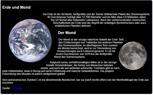
Beispiel für runde Körper
ansehen …
.erde {
  shape-outside circle(50% at 50% 50%) border-box;
  shape-margin 1.5em;
  floatleft;
}

.mond{
  shape-outside circle(40% at 50% 50%) border-box;
  shape-margin 1em;
  float right;
}
    <img class="erde" src="erde.png" >
    <p>Text ...</p>
    <img class="mond" src="mond.png" alt="" >
    <p>Der Mond ist ... </p>
Sonne und Mond sind gefloatete Bilder, deren Formen durch ausgeschnitten und dann vom Text umflossen wird.
shape-outside: (polygon)Bearbeiten
Beispiel
ansehen …
img {
  float left;
  clip-path polygon(0% 0%, 100% 50%, 0% 100%, 0% 0%);
  shape-outside polygon(0% 0%, 100% 50%, 0% 100%, 0% 0%);
}

img:hover {
    shape-outsidepolygon(0% 0%, 100% , 0% 100%, 0% 0%);
    clip-path polygon(0% 0%, 100% 0%, 0% 100%, 0% 0%);
  }
shape-outside: (url)Bearbeiten
Beispiel
ansehen …
img.form {
  float left;
  shape-outside url(Rugby.png);
  shape-image-threshold .;
  shape-margin 1em;
}
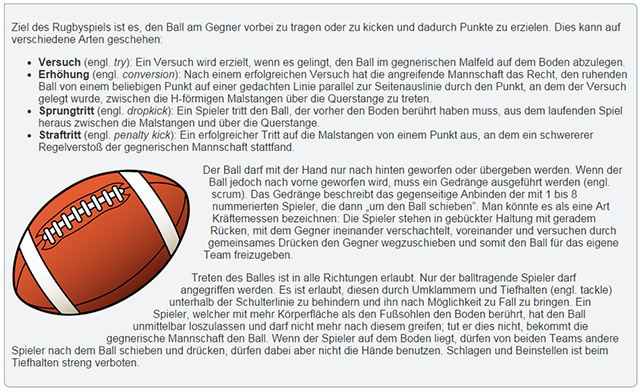
  <img class="form" src="Rugby.png" alt="">
  <p>Ziel des Rugbyspiels ist es, ...</p>
Hier wird der Textumfluss an die Form des Bilds angepasst. Dies wird durch Angabe des URI des Bildes erreicht. Mit können sie festlegen, welche Alphawerte zur Berechnung der Transparenz herangezogen werden sollen.
Beachten Sie, dass die transparenten Bereiche der Grafik groß genug für die Definition eines Rands durch sein müssen. Auch die links über den Rand ragenden Aufzählungszeichen der Liste beeinflussten das Ergebnis des Textumflusses. Eine Positionierung der Grafik in den zweiten Textabsatz umging diese Probleme.
shape-marginBearbeiten
Die Eigenschaft shape-margin legt einen Abstand um das umflossene Objekt fest.
Beachten Sie: Der Abstand kann nicht über die tatsächliche Größe des in festgelegten Objekts hinausgehen.
Empfehlung:
Wenn Sie einen Außenabstand festlegen wollen;
- Reduzieren Sie den Radius eines Kreises (Ein Kreis mit hat keine Möglichkeit für einen Außenrand.)
- Verkleinern Sie die Abbildung einer Rastergrafik, bzw. vergrößern Sie den transparenten Bereich.
shape-image-thresholdBearbeiten
Die Eigenschaft shape-image-threshold definiert, welcher Grad an Deckkraft (opacity) zur Erzeugung der Form herangezogen wird.
Es ist ein Wert zwischen 0.0 (völlig transparent) und 1.0 (völlig abdeckend) möglich. Standardwert ist 0.0.
Ein Wert von 0.5 bedeutet, dass nur Pixel mit einer Deckkraft von 50% und mehr zur Erzeugung der Form herangezogen werden.
Using shape-image-threshold To Position Text Over A Semi-Opaque Image
So far we have looked at using a completely transparent part of an image or of a gradient in order to create our shape, however, the third property defined in the CSS Shapes specification means that we can use images or gradients with semi-opaque areas by setting a threshold. A value for of means fully opaque while means fully transparent.
A gradient like our example above is a great way to see this in action as we can change the value and move the line along which the text falls to more opaque areas or more transparent areas. This property works in exactly the same way with an image that has an alpha channel yet is not fully transparent.
See the Pen Smashing Shapes: shape-image-threshold by Rachel Andrew (@rachelandrew) on CodePen.
See the Pen Smashing Shapes: shape-image-threshold by Rachel Andrew (@rachelandrew) on CodePen.
This method of creating shapes from images and gradients is — I think — the most straightforward way of creating a shape. You can create a shape as complex as you need it to be, in the comfort of a graphics application and then use that to define the shape on your page. That said, there is another way to create our shapes, and that’s by using Basic Shapes.
Using CSS Shapes Editor
CSS Shapes Editor is a Chrome extension. Once you have installed it, it adds a new tab named Shapes in DevTools under the Elements tab, inline with the other sub-tabs (Styles, Computer, etc.)
The Shapes tab contains a property paired with a plus + sign to help us add CSS Shape functions. Let’s select the and the element on the page, then we can start drawing the shape right in the browser just like a graphics application.
As we draw, the browser extension will update our polygon function with the respective coordinates of the shape drawn, simultaneously adding it as an inline style to the element. Once done, copy the generated code and paste it into your stylesheet.
Generated polygon coordinates
Using this same technique we can easily draw and apply any form or shape on our webpage, for instance:
Image from How to Add Drama to a Rainy Scene With Adobe Photoshop
Drawing Basic CSS Shapes
Let’s start with the basic shapes like square, rectangle, triangle, circle, and ellipse.
Square and Rectangle
Square and rectangle are the easiest shapes to make in CSS. All you need to do is to create a <div> and give it a height and a width.
HTML
CSS
Output:
Circle and Ellipse
You just need to assign a border-radius of 50% to a square and you’ll get a circle. Do the same with the rectangle to get an ellipse.
HTML
CSS
Output:
Triangles
We’ll use borders to create triangles. Wondering how it works? All you need to do is to set the width and height of the triangle to zero. It means, moving forward, the actual width of the element will be the width of the border. Also, you may already know that the border edges are 45-degrees diagonals to each other. Give different colors to each border and set any three of them to transparent. Ultimately, you’ll have your triangle.
HTML
CSS
Output:
You can play around with height and border-color to get different types of triangles. For instance, you can create a triangle pointing towards the upward direction by giving the border-bottom a solid color while all the other borders are set to transparent. Also, you can create a triangle pointing towards the right direction or a right-angle triangle by playing around with border-width and border-color.
HTML
CSS
Output:
Border-Radius Property
The border-radius property is an important concept to understand before styling any CSS figures. It allows rounding corners of HTML elements. The curve for each angle is determined by one or two radii defining its shape — a circle or an ellipse. The radius extends to the entire background, even if the element has no borders.
The border-radius property allows rounding all corners of HTML elements at the same time. If you set two values for the border-radius property, the first value will round the upper left and lower right corners, and the second one will round the upper right and lower left corners. You can use px, em, % or other units to set values.
By using the border-top-left-radius, border-top-right-radius, border-bottom-left-radius, and border-bottom-right-radius properties, you can round each corner in its own way.
The values separated by the slash (/) symbol define the horizontal and vertical radii.
Below are some examples of shapes with different border radii.
There are online instruments to play with different border radii: link 1, .
Read also our article about CSS buttons.
Tools for working with CSS Shapes
You can create paths in classic image authoring tools, but none of them, at the time of this writing, exports the required syntax for CSS Shapes values. Even if they did, working like that wouldn’t be too practical.
CSS Shapes are meant to be used in the browser, where they react to other elements on the page. It’s very useful to visualize the effects of editing the shape on the content which surrounds it. There are a few tools to help you with this workflow:
Brackets: The CSS Shapes Editor extension for Brackets uses the code editor’s live preview mode to overlay an interactive editor for editing shape values.
Google Chrome: The CSS Shapes Editor extension for Google Chrome extends the browser’s Developer Tools with controls to create and edit shapes. It places an interactive editor on top of the selected element.
The inspector in Google Chrome has built-in support for highlighting shapes. Hover over an element with a property and it will light up to illustrate the shape.
Shapes from images: If you prefer to generate images and have the browser extract shapes from them, Rebecca Hauck has written a good tutorial for Photoshop.
Polyfill: Google Chrome is the first major browser to ship CSS Shapes. There is upcoming support for the feature on Apple’s iOS 8 and Safari 8. Other browser vendors may consider it in the future. Until then, there is a CSS Shapes polyfill to provide basic support.
Reference boxes for CSS Shapes
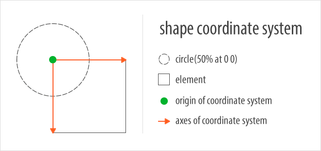
The reference box is a virtual box around the element, which establishes the coordinate system used to draw and position the shape. The origin of the coordinate system is at its upper-left corner with the X-axis pointing to the right and the Y-axis pointing down.
Remember that alters the shape of the float area around which content will wrap. The float area extends to the outer edges of the box defined by the property. This is called the and it is the default reference box for a shape if none is explicitly mentioned.
The following two CSS declarations have identical results:
.element{
  shape-outside: circle(50% at 0 0);
  /* identical to: */
  shape-outside: circle(50% at 0 0) margin-box;
}
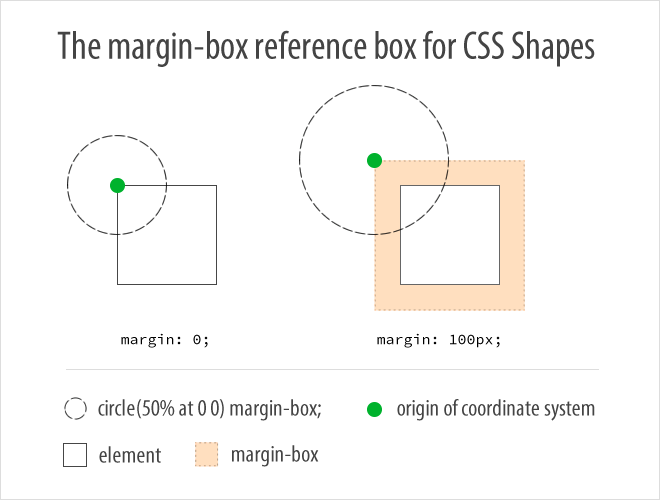
We have not yet set a margin on the element. At this point it is safe to assume that the origin of the coordinate system and the circle center are at the upper-left corner of the element’s content area. This changes when you do set a margin:
.element{
  shape-outside: circle(50% at 0 0) margin-box;
  margin: 100px;
}
The origin of the coordinate system now lies outside the element’s content area (100px up and 100px left), as does the circle center. The computed value of the circle radius also grows to account for the increased surface of the coordinate system established by the reference box.
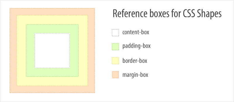
There are a few reference box options to choose from: , , and . Their names imply their boundaries. We previously explained the . The is constrained by the outer edges of the element’s borders, the is constrained by the element’s padding, while the is identical to the actual surface area used by the content within an element.
Only one reference box can be used at a given time with a declaration. Each reference box will influence the shape in a different and sometimes subtle way. There is another article which delves deeper and helps you understand reference boxes for CSS Shapes.
clamp()
Она сочетает в себе и . Функция получает на вход параметры:
И вычисляет значение вот таким образом:
Проще всего её понимать представляя среднее значение () как желаемое, которое ограничено минимальным и максимальным значениями. Например, этот код
описывает следующее поведение: размер шрифта равен , но не меньше и не больше . Порастягивайте демо, чтобы увидеть как это работает:
Аналогичный подход часто используется при разработке адаптивных сайтов: мы задаём минимальное и максимальное значения ширины страницы, позволяя ей тянуться и сжиматься в заданных пределах, например, в диапазоне от до :
Используя это можно записать в одну строчку:
Для следующего демо я взяла значения поменьше, но смысл тот же: блоки тянутся в пределах от до . Ширина верхнего блока управляется с помощью и , нижнего — с помощью :
Оба блока ведут себя совершенно одинаково, разница только в возможностях этих подходов: позволяет добавить умную динамику значений в любое свойство, не только в размеры блоков. Мне нравится идея использовать для адаптивных шрифтов, почитать про это можно в статье Linearly Scale font-size with CSS clamp() Based on the Viewport.
Предыдущие функции достаточно просты по сравнению с , самой мощной и интересной.
Using A Gradient For Our Shape
A CSS gradient is just like an image, which means we can use a gradient to create a shape, which can make for some interesting effects. In this next example, I have created a gradient which goes from blue to transparent; your gradient will need to have a transparent or semi-transparent area in order to use shapes. Once again, I have used generated content to add the gradient and am then using the gradient in the value for .
Once the gradient becomes fully transparent, then the shape comes into play, and the content runs along the edge of the gradient.
See the Pen Smashing Shapes: gradients by Rachel Andrew (@rachelandrew) on CodePen.
See the Pen Smashing Shapes: gradients by Rachel Andrew (@rachelandrew) on CodePen.
Shapes from the Box Model
Another choice for defining your float area is to use the element’s built in box model. For simple rounded corners, you can also get the rounded corner effect by using box models for your float area too.

You can use the various box model areas as your float area. I’ve added an image below to remind you of the various parts of the box model in CSS:
- The blue area is the . This is made up of the margin of the element and is outside the element’s boundary.
- The black area is the . In the case of the example above, we’ve got a border of 2px.
- The orange area is the . This is the area that surrounds your content (e.g. our image).
- The image itself is in the . This is the box area that holds our image.
You can use these boundary areas as the float area like so:
Basically, whichever you define will be where the text will wrap to. If you define the as , then the text will wrap up to the edge of your margin (e.g. the blue area in the example above). If you define it as , it will wrap to the edge of your border, and so on.
One of the simple uses of this is to give your image float area rounded corners (just like we did with but a bit simpler to implement and maintain). This CSS will add a 5px gap between our image and the text, while also wrapping the text around the image with a 150px value:
Which looks like this:
And on CodePen:
See the Pen CSS Shapes Demo #10 by SitePoint (@SitePoint) on CodePen.
The same effect with the can be done with , , and — it just changes how close the text gets to the image.
Элементы формы
| Элемент | Описание |
|---|---|
| <form> | Устанавливает форму на веб-странице |
| <input> | Создает различные элементы формы (текстовые поля, кнопки, переключатели и т.д.) в зависимости от значения атрибута type |
| <textarea> | Создает многострочное текстовое поле |
| <fieldset> | Группирует элементы формы. Может также содержать внутри себя элемент legend с условными обозначениями элементов формы, составляющих логическую группу |
| <button> | Многофункциональная кнопка |
| <label> | Устанавливает связь между определенной меткой и элементом формы (input, select, textarea) |
| <legend> | Применяется для создания заголовка группы элементов формы, которая определяется с помощью тега fieldset |
| <optgroup> | Представляет собой контейнер, внутри которо-го располагаются теги option, объединенные в одну группу |
| <option> | Определяет отдельные пункты списка, созда-ваемого с помощью контейнера select |
| <select> | Позволяет создать элемент интерфейса в виде раскрывающегося или прокручиваемого списка |
| <datalist> | Позволяет предоставить раскрывающийся список с предложенными значениями для любого типа поля ввода |
CSS Speech (Синтез речи в CSS)
Speech содержит свойства,
указывающие как отображается документ синтезатором речи: объем,
голос, скорость, высота, сигналы, паузы и т. д. Модуль ACSS (Aural
CSS) был уже в CSS2, но он никогда не был правильно реализован и
был несовместимым с Speech Synthesis
Markup Language (SSML), языком W3C для контроля над
синтезаторами речи. CSS2 модуль ACSS был разделен на две части:
речь (для фактического вещания, совместимый с SSML) и (аудио) (для звуковых эффектов на других
устройствах). Свойства речи в CSS3 будут схожими с такими же
свойствами в CSS2, но будут иметь разные значения. (Старые свойства
могут еще использоваться с устаревшим медиа типом ‘aural’
(слуховой), но новые свойства должны использоваться в новой среде
‘speech’ (речь), так же, как в таблицах стилей для медиа ‘all’
(все)).
Using Generated Content For Our Shape
In the case above, we have the image displayed on the page and then the text curved around it. However, you could also use an image as the path for the shape in order to create a curved text effect without also including the image on the page. You still need something to float, however, and so for this, we can use Generated Content.
See the Pen Smashing Shapes: generated content by Rachel Andrew (@rachelandrew) on CodePen.
See the Pen Smashing Shapes: generated content by Rachel Andrew (@rachelandrew) on CodePen.
In this example, we have inserted some generated content, floated it left, given it a width and a height and then used with our image just as before. We then get a curved line against the whitespace, but no visible image.
Animating shapes
You can mix CSS shapes with many other CSS features, such as transitions and animations. Though, I must stress that users find it very annoying when text layout changes while they’re reading. Pay close attention to the experience if you do decide in favor of animating shapes.
You can animate the radii and centers for and shapes as long as they’re defined in values that the browser can interpolate. Going from to is possible. However, animating between to will choke the browser.
.element{
  shape-outside: circle(30%);
  transition: shape-outside 1s;
  float: left;
}

.element:hover{
  shape-outside: circle(50%);
}
More interesting effects can be achieved when animating shapes, with the important note that the polygon must have the same number of vertices between the two animation states. The browser can’t interpolate if you add or remove vertices.
One trick is to add the maximum amount of vertices you need and position them clustered together in the animation state where you want fewer perceived edges to the shape.
.element{
  /* four vertices (looks like rectangle) */
  shape-outside: polygon(0 0, 100% 0, 100% 100%, 0 100%);
  transition: shape-outside 1s;
}

.element:hover{
  /* four vertices, but second and third overlap (looks like triangle) */
  shape-outside: polygon(0 0, 100% 50%, 100% 50%, 0 100%);
}
Menus
Icon BarMenu IconAccordionTabsVertical TabsTab HeadersFull Page TabsHover TabsTop NavigationResponsive TopnavNavbar with IconsSearch MenuSearch BarFixed SidebarSide NavigationResponsive SidebarFullscreen NavigationOff-Canvas MenuHover Sidenav ButtonsSidebar with IconsHorizontal Scroll MenuVertical MenuBottom NavigationResponsive Bottom NavBottom Border Nav LinksRight Aligned Menu LinksCentered Menu LinkEqual Width Menu LinksFixed MenuSlide Down Bar on ScrollHide Navbar on ScrollShrink Navbar on ScrollSticky NavbarNavbar on ImageHover DropdownsClick DropdownsCascading DropdownDropdown in TopnavDropdown in SidenavResp Navbar DropdownSubnavigation MenuDropupMega MenuMobile MenuCurtain MenuCollapsed SidebarCollapsed SidepanelPaginationBreadcrumbsButton GroupVertical Button GroupSticky Social BarPill NavigationResponsive Header